In the pest control and wildlife removal industry, your website is often the first point of contact for a customer in a high-stress situation. Whether it’s an emergency infestation or a routine commercial inspection, your digital presence must immediately communicate technical authority, safety, and rapid responsiveness.
Our design team analyzed hundreds of websites across the industry – from local residential exterminators to large-scale commercial pest management and wildlife relocation services. We looked beyond aesthetics to identify the sites that masterfully utilize urgency-driven CTAs, pest identification resources, and transparent service area mapping.
Whether you are an independent operator or a national franchise, these 10 examples represent the gold standard for pest control web design in 2026.
Note on Our Selection Process: We recently audited this guide to remove outdated designs and sites that no longer meet our performance standards. This curated list now focuses on the top 10 pest control websites providing the most strategic value in 2026.
Top Pest Removal Website Designs
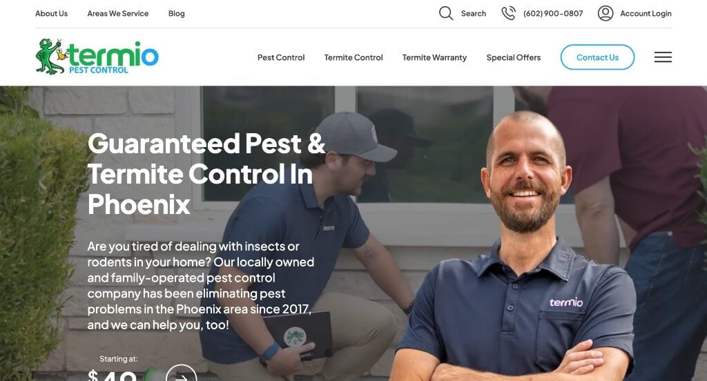
1. Termio Pest Control
Why We Chose Termio Pest Control
The Termio Pest Control website is a standout example of “Branded Authority and Professional Personality.” By combining high-production video with a memorable mascot, the site successfully transforms a “gritty” service industry into a friendly, approachable, and highly professional brand experience.
Key Design Highlights:
- High-Production “Owner-Overlay” Hero: The hero section features a dynamic video of the team in action with a professional overlay of the business owner. This design choice creates an immediate sense of accountability and trust; seeing the face behind the company alongside the actual work being performed humanizes the brand in a way that stock photos never could.
- Iconic “Lizard” Brand Consistency: The site makes excellent use of a distinct lizard mascot that is integrated throughout the web design and shown on their branded vehicles. This level of visual consistency builds massive brand recall, making the company instantly recognizable to local residents who see their trucks in the neighborhood.
- Interactive Pest Encyclopedia: The homepage features a comprehensive list of specific insects and pests they treat, with each entry linking to a dedicated page for more information. This not only positions Termio as a knowledgeable expert but also serves as a valuable resource for homeowners trying to identify their specific problem.
- Persistent Mobile Accessibility: The header and hero area are engineered for conversion, keeping the phone number and contact tools highly visible. On mobile, the phone icon stays pinned to the interface, ensuring that a homeowner in the middle of a “pest emergency” can reach a technician with a single tap.
- Strategically Sprinkled Social Proof: Rather than grouping all reviews in one section, the site sprinkles testimonials throughout the homepage. This “constant reinforcement” strategy ensures that as the user learns about different services, they are continually reminded of the company’s high success rate and positive customer reputation.
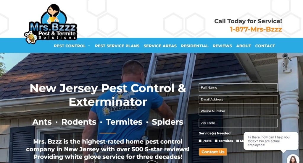
2. Mrs.Bzzz Pest & Termite Solutions of New Jersey
Why We Chose New Jersey Bug Killers
The New Jersey Bug Killers website is a masterclass in “Regional Urgency and Direct Access.” By prioritizing immediate contact and clear geographic boundaries, the site caters perfectly to homeowners facing a pest crisis who need to know two things instantly: “Can you help me right now?” and “Do you service my town?”
Key Design Highlights:
- Zero-Lag Lead Generation: The hero area features a prominent contact form integrated directly into the main visual. This “speed-to-lead” design ensures that visitors can submit their details the second the page loads, bypassing the need to scroll or navigate to a separate contact page during a high-stress pest discovery.
- Persistent Mobile Connectivity: Recognizing that many pest control searches happen on the fly, the site keeps the phone number clearly visible in the mobile header. This persistent placement allows for “one-tap” calling, ensuring that the company is always reachable for emergency consultations.
- Geographic Visual Authority: The homepage includes a detailed service area map specifically identifying the New Jersey counties they cover. This visual tool immediately validates their local expertise and helps users confirm service availability without having to search through a list of zip codes.
- Value-Focused “Why Choose Us”: The dedicated “Why Choose Us” section on the homepage effectively builds trust by highlighting their specific credentials, such as their years of local experience and specialized treatment methods. This section provides the professional “why” behind their services, reassuring the customer that they are hiring a vetted expert.
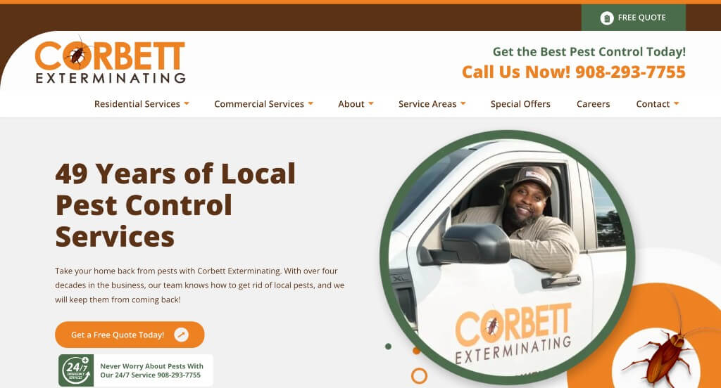
3. Corbett Exterminating
Why We Chose Corbett Exterminating
The Corbett Exterminating website is a premier example of “Diagnostic Design and Mobile Accessibility.” By centering the user experience around immediate problem identification and persistent contact options, the site ensures that a homeowner’s path from “finding a bug” to “booking a solution” is as short and stress-free as possible.
Key Design Highlights:
- Interactive Pest Identification: A standout feature is how the homepage outlines various bug types (like termites, bed bugs, and rodents) using clear visual icons. This diagnostic approach allows users to immediately identify their specific issue and find the relevant treatment information without digging through complex menus.
- Direct-Entry Quote Request: To maximize lead generation, the site features a prominent “Free Quote” form directly on the homepage. This allows high-intent visitors to submit their information and start the estimate process the moment they land on the site, effectively capturing leads before they have a chance to bounce.
- Expertise-Driven Authority: The homepage showcases a featured blog section, providing visitors with professional insights and pest prevention tips. This content-first strategy helps build trust, positioning the company as a knowledgeable industry expert rather than just a service provider.
- Conversion-Optimized Mobile Experience: For users on the go, the mobile site includes sticky buttons that remain anchored at the bottom of the screen. These persistent calls-to-action ensure that the “Call” and “Quote” options are always within thumb-reach, providing a frictionless experience for homeowners dealing with an urgent pest emergency.
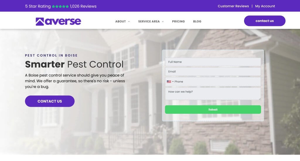
4. Averse
Why We Chose Averse Pest Control
The Averse Pest Control website is a masterclass in “Immediate Value and Technical Polish.” By prioritizing core brand differentiators and high-visibility social proof from the very top of the page, the site establishes a level of professional trust that is essential for a service-based business.
Key Design Highlights:
- Rapid Value Proposition: Immediately below the hero area, the site features a “6 Reasons to Choose Averse” section. This strategic placement ensures that before the user even begins to scroll, they are presented with a concise, persuasive argument for why this company stands out from the competition.
- Interactive Service Discovery: The homepage includes a visually polished, clickable service section. This interactive layout allows users to engage with different pest categories in a way that feels modern and intuitive, providing a smooth path to deeper information on specific treatments.
- Header-Integrated Social Proof: In a brilliant move for instant credibility, the Google review rating is noted directly in the header. By placing their high rating alongside the logo and navigation, Averse ensures that every visitor sees their 5-star reputation as the very first “stamp of approval.”
- Mobile-First Contact Points: The mobile experience is optimized for quick action, featuring a prominent phone number icon in the header. This ensures that for customers dealing with an urgent pest sighting, the ability to call for help is always a single, effortless tap away.
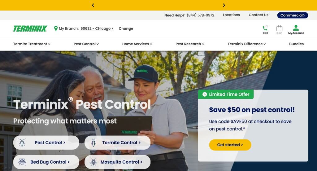
5. Terminix
Why We Chose Terminix
The Terminix website is a premier example of “National Brand Authority.” By utilizing consistent corporate branding and a vast educational resource directly on the homepage, the site establishes a high level of professional trust while ensuring homeowners have immediate access to the information they need to protect their property.
Key Design Highlights:
- Educational Pest Resource: The homepage features a comprehensive pest area that explains the various species they can protect against. This educational approach helps users identify their specific problem and learn about the professional solutions available to them.
- Integrated Social Proof: Integrated Google reviews on the homepage provide real-time social proof. By showcasing feedback from actual customers, the site leverages national reputation to build local trust with every visitor.
- Proactive Information Hub: A dedicated FAQ section on the homepage addresses common concerns and logistical questions. This proactive strategy helps resolve potential hesitations and qualifies leads before they even reach out for a quote.
- Branded Visual Consistency: The images used throughout the homepage prominently feature actual Terminix staff and recognizable branding. This focus on real people and branded equipment reinforces the company’s identity and provides visual assurance of its professional standards.
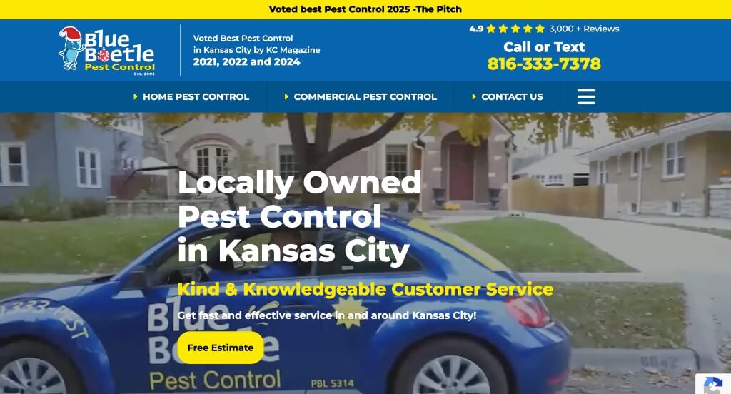
6. Blue Beetle Pest Control
Why We Chose Blue Beetle Pest Control
The Blue Beetle Pest Control website is an excellent example of “Transparent Local Branding.” By putting their pricing and family-centric values front and center, they remove the mystery often associated with service costs and build an immediate emotional connection with the community.
Key Design Highlights:
- Immediate Trust Validation: Google reviews are featured prominently on the home page directly below the hero area. This high-level placement ensures that the very first thing a visitor sees after the initial headline is a strong set of third-party endorsements, establishing credibility instantly.
- Transparent Solution Programs: The site offers various solution programs that are explained clearly on the home page with transparent pricing. Providing actual dollar amounts for recurring services is a powerful conversion tool that builds trust and allows potential customers to make informed decisions without having to wait for a callback.
- Humanized Brand Identity: The fact that they are a family-owned business is mentioned on the home page and accompanied by family pictures. This personal touch differentiates them from large national corporations and appeals to local customers who prefer to keep their business within the community.
- Geographic and Technical Clarity: The types of pests they treat and their specific service area are clearly outlined on the home page. This ensures that users don’t have to go hunting for basic information, quickly confirming whether the company is the right fit for both their specific pest problem and their physical location.
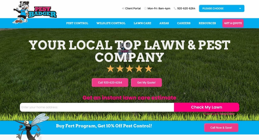
7. Pest Badger
Why We Chose Pest Badger
The Pest Badger website is a standout example of vibrant branding and high-visibility calls to action. By leaning into a memorable visual identity and making the inquiry process nearly effortless, the site manages to feel both playful and highly professional, ensuring it sticks in the mind of the consumer.
Key Design Highlights:
- Memorable Visual Identity: The use of high contrast colors and an adorable logo make this site stand out right away. This bold aesthetic choice creates instant brand recognition and sets a friendly, approachable tone that helps differentiate them from more clinical-looking competitors.
- Optimized Mobile Accessibility: The phone number is easily accessible on mobile in the header. This persistent placement ensures that users browsing on their phones can trigger a call with a single tap, which is vital for capturing leads during urgent pest or lawn care situations.
- High-Frequency Conversion Points: The site includes easy ways to get a quote throughout the home page. By sprinkling call-to-action buttons and forms across different sections, the design ensures that a visitor is never more than a short scroll away from starting the estimate process.
- Diversified Service Clarity: The layout nicely outlines the services they offer, from pest control to lawn care. This clear categorization allows homeowners to see the full scope of the company’s expertise at a glance, positioning Pest Badger as a comprehensive solution for exterior home maintenance.

8. Triangle Pest Control
Why We Chose Triangle Pest Control
The Triangle Pest Control website excels at creating a sense of reliability and localized expertise. By combining a clear operational roadmap with strong social proof, the design effectively transitions a visitor from a state of concern about pests to a state of confidence in the company’s professional process.
Key Design Highlights:
- Process Transparency: The home page shows a 3-step customer service process. This simplified breakdown helps demystify the service for the customer, setting clear expectations for what to expect, from the initial quote to the final result.
- Reputation Validation: The site features integrated Google reviews directly on the landing page. By pulling in real-time feedback from satisfied clients, the company leverages third-party credibility to verify its high level of service quality before a user even reaches out.
- Value-Based Trust Building: There is a dedicated “Why Homeowners Trust Us To Protect Their Home’ section on the home page. This area allows the brand to speak directly to its core values and unique selling points, addressing the emotional and practical reasons why a customer should choose them over a competitor.
- Geographic Visualization: The site includes a cool-looking service area map above the footer. This stylized map provides an immediate visual confirmation of their coverage zones, making it easy for local residents to identify if they are within the service region while adding a high-end, custom feel to the bottom of the page.
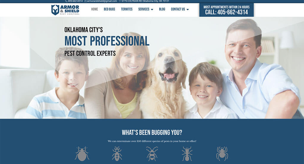
9. Armor & Shield Pest Control
Why We Chose Armor & Shield Pest Control
The Armor & Shield Pest Control website uses interactive design elements and comprehensive contact options to create a modern and accessible user experience. By blending technical flair with clear value statements, the site manages to engage visitors while making the process of starting a service feel effortless.
Key Design Highlights:
- Mission-Driven Value: The “Protecting your space” section on the home page highlights the ways Armor Shield Pest Control protects your home. This section clearly defines their protective philosophy, giving homeowners a quick understanding of the specific methods and care they use to secure a property against pests.
- Interactive Engagement Feature: The background on the home page has little floating dots moving around with a mouse-over effect where a line appears trying to connect the dots. This unique interactive element adds a layer of modern sophistication to the site and provides a subtle “gamified” experience that keeps users on the page longer.
- Verified Social Proof: The site utilizes integrated Google reviews to showcase real-world customer satisfaction. By bringing this data directly onto the homepage, they provide immediate evidence of their reliability and help build trust through transparent, third-party feedback.
- Multi-Channel Contact Accessibility: A dedicated contact section on the home page with a form, phone number, email, and address makes reaching out easy. Providing every possible way to connect – whether a user prefers a quick digital form or a traditional phone call – ensures that there are no barriers to starting a conversation.
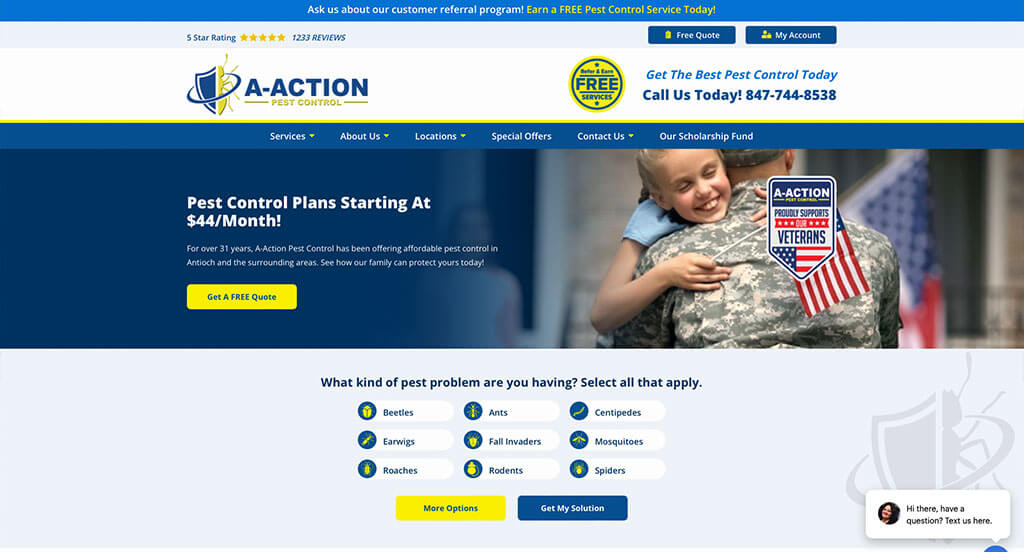
10. A-Action Pest Control
Why We Chose A-Action Pest Control
The A-Action Pest Control website focuses on speed and regional specificity to capture local leads effectively. By placing the most critical information – what they do, where they do it, and how to get a price – at the very top of the hierarchy, the site minimizes the effort required for a customer to take action.
Key Design Highlights:
- Immediate Service Identification: The pests they treat for are shown right below the hero area. This immediate visual and textual confirmation ensures that visitors don’t have to scroll to find out if the company handles their specific issue, such as ants, spiders, or rodents.
- High-Priority Lead Capture: A free quote form is positioned high up on the home page. Placing the primary conversion tool in such a prominent location caters to users who are ready to engage immediately, making the transition from visitor to lead as fast as possible.
- Granular Geographic Transparency: They list every city they work in directly on the site. This exhaustive list of service locations provides absolute clarity for homeowners in their region and serves as a powerful local SEO tool to help them appear in searches across various municipalities.
- Educational Content Integration: The blog is featured on the home page to provide ongoing value to visitors. By highlighting recent articles, the company demonstrates its industry expertise and offers helpful tips that keep the brand top-of-mind for homeowners interested in pest prevention.
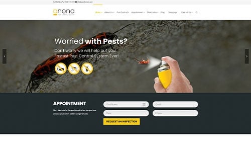
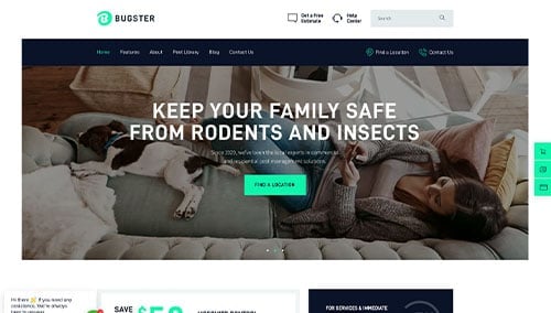
WordPress Pest Control Themes
You can find free themes at wordpress.org, or consider pest control-inspired templates on ThemeForest.
Anona – Themeforest
$60
Bugster – Themeforest
$69
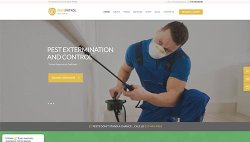
BugsPatrol – Themeforest
$69
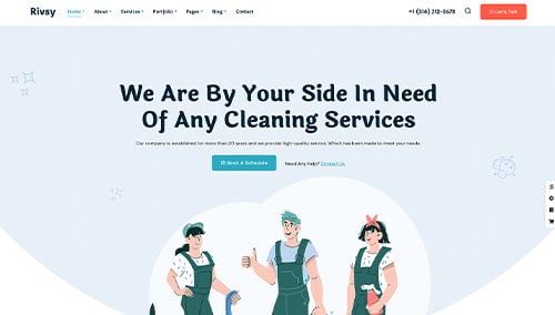
Rivsy – Themeforest
$49