In the insurance industry, a website is far more than a digital business card – it is a critical engine for lead generation and consumer trust. For modern agencies and carriers, an online presence must achieve a difficult balance: projecting rock-solid financial stability while offering a frictionless, high-speed user experience. To thrive in today’s digital-first market, your design must turn complex policy information into clear, actionable pathways for the consumer.
Our team evaluated hundreds of insurance platforms – ranging from independent local agencies and captive carriers to global risk management consultants and digital marketplaces. We narrowed the field to the top 10 examples that represent the gold standard for the industry. Our analysis focused specifically on conversion-optimized quote funnels, mobile-responsive claim portals, and the strategic use of trust signals that alleviate “buyer’s remorse” before the first premium is even paid.
Whether you are a benefits consultant looking to modernize your brand or a niche adjuster scaling your reach, these examples provide the definitive benchmark for insurance web design in 2026.
Note on Our Selection Process: We recently audited this list to ensure every featured site meets current standards for data security, accessibility, and loading speed. This curated collection focuses on the top insurance websites providing the most strategic value to both the agent and the policyholder in 2026.
Top Insurance Agent Website Designs
1. Insurify
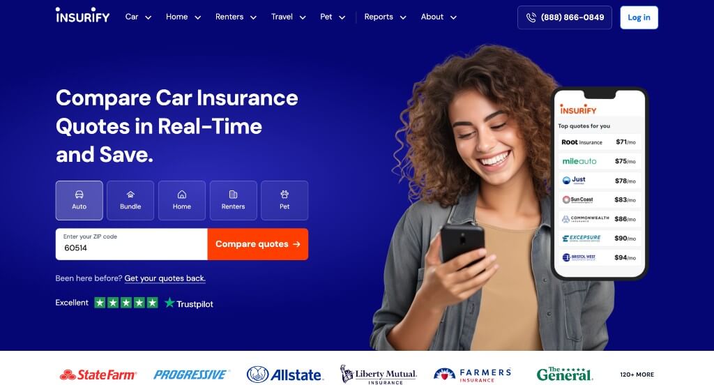
Right off the bat, a form is featured to receive a quote for insurance, whether you are looking for home, auto or a bundle. Brightly colored buttons are sprinkled throughout so clients can navigate easier. A frequently asked questions can be noticed closer to the bottom. Insurify also had a great balance of images, written content and white space ensuring that it wasn’t overwhelming.
2. Lemonade
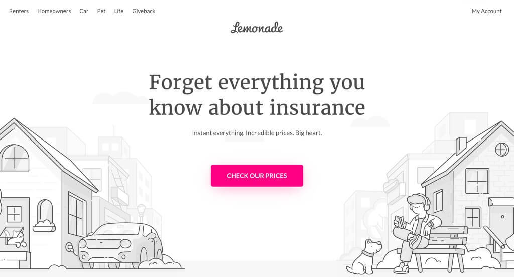
We instantly noticed how attractive and creative this company’s webpage is. Everything is black and white for writing and visuals, with a pop of bright pink to attract attention to information they want you to see. Client testimonials automatically scroll, allowing newcomers to read as many as they wish. We liked how their company name invokes a playful feel, relaxing its customers. Social media links, such as Instagram, Facebook, and Youtube, can also be seen to stay in touch with their company.
3. Worth Insurance
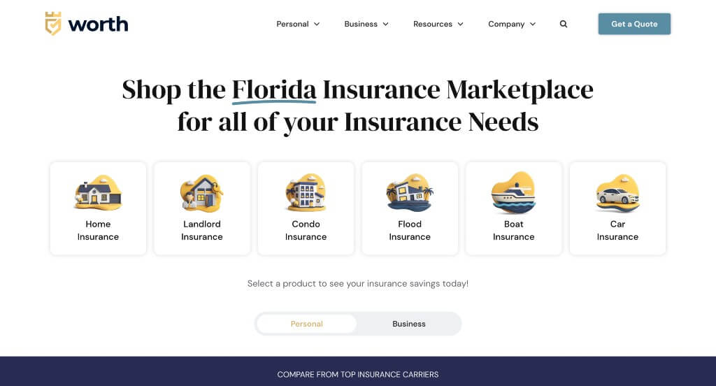
We loved how this example made good use of graphics that made sense for their business. Along with that, we loved their color scheme that was used throughout the pages. Including buttons and links was a great way to get information customers without overwhelming them. This web domain matched carefully with their company name which we appreciated.
4. The Zebra
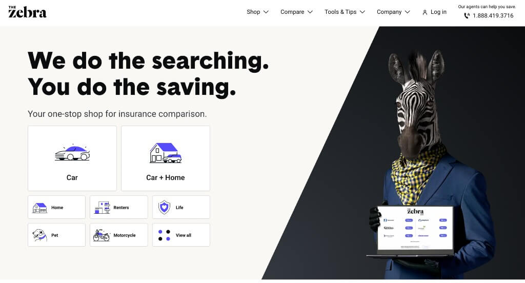
This is a very straightforward template, and we thought it was smart to chose a color scheme that was simple but also matched their company name. Right away options for different types of insurance are included. It was smart to have simple forms to fill out after clicking on the type of insurance you are looking for.
5. CoverHound
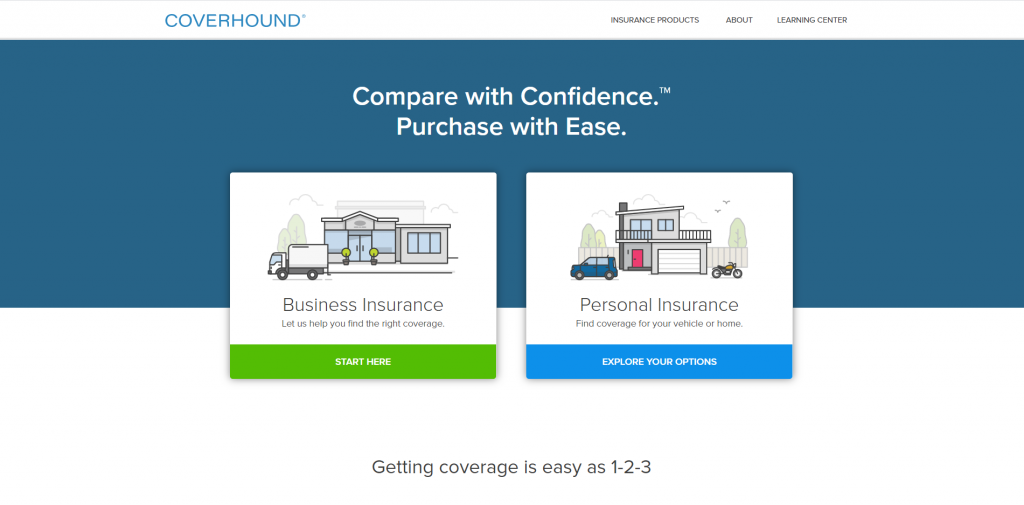
An organized design is shown here with each service labeled and separated into different groups, making it easier to browse through to find a service helpful to you. Also seen on the homepage were customer testimonials, helpful articles, and social media links. We really liked how buttons and bright accent colors were added in. Don’t forget about this company’s stunning balance of images, white space and written content.
Related: Your insurance company might be interested in digital marketing services to help with lead generation, social media management, and online reputation.
6. Oscar
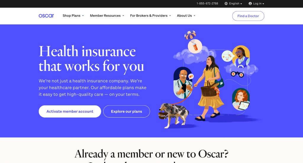
Bright colors flood this site right away to evoke an energetic feel. We thought it was smart to have a phone number visible right away, a button to find a doctor, and a button to activate an account. Oscar wants to get information customers might need to them as soon as possible. A frequently asked question section is visible, along with informative blogs to sprinkle in more information.
Related: Your insurance agencies can consider PPC management services to get help improving the return on investment from your paid ads campaigns.
7. Figo Pet Insurance
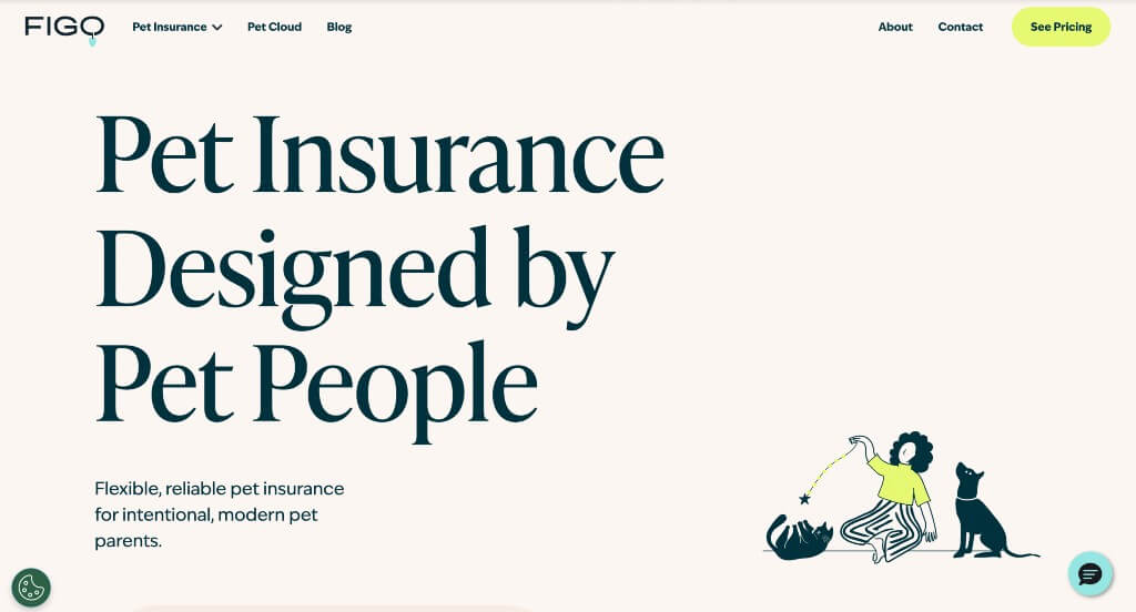
We really liked this example because of their more relaxed color palette. Their use of simplistic graphics was another thing that we noticed because it creates a unique feel for their pages. It was also nice how a variety of phrases are used throughout the layout in order to highlight certain information. Including customer reviews was another choice that we really liked.
8. Policygenius
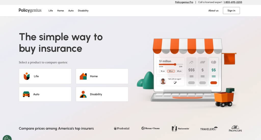
Policygenius attracts attention of incoming customers with their color scheme and their bold and strong headlines. Understanding that other insurance companies could look similar to them, they attempt to stand out by offering services and a template competitors don’t. Including a 24/7 chat service to help customers whenever it’s needed was nice. Adding in many graphics also makes this sight more organized.
9. CarInsurance.com
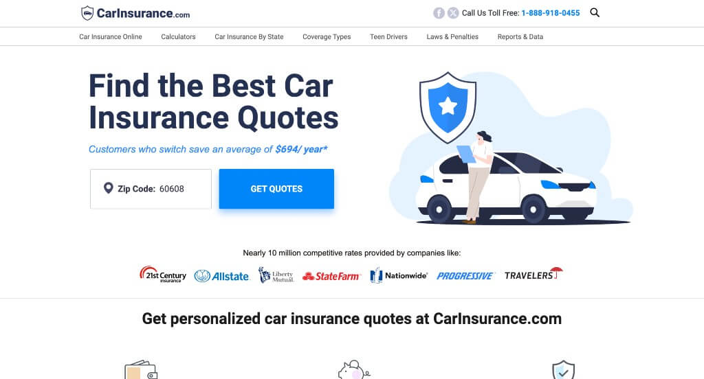
Graphics was likely the first thing that we noticed about this example. Their domain was an exact match to their business name which made it very easy to find their website. Building in information about a variety of different car insurance brands was something that many people could find helpful. Lots of buttons were also used to create an outstanding template.
10. Honeycomb Insurance
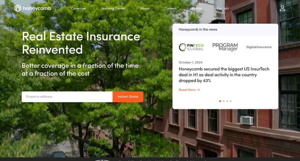
We loved the orange accents that highlight a variety of information within their pages. Adding in a search bar to create an instant quote based off of customers address was a nice choice. Adding in icons was another thing that we really liked because it added visuals without cluttering the pages with lots of images.
WordPress Insurance Themes
You can find free themes at wordpress.org or explore insurance-inspired templates at ThemeForest.
Insur – Themeforest
$49
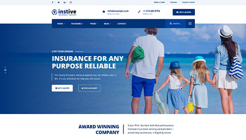
Instive – Themeforest
$55
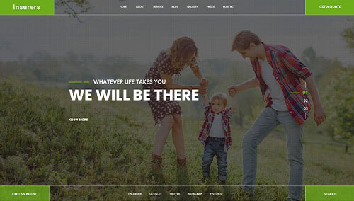
Insurers – Themeforest
$49
InsuRel – Themeforest
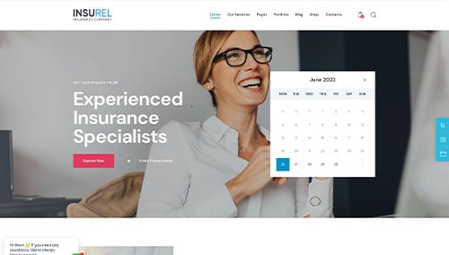
$69