In today’s digital age, having a well-designed site is crucial for building a strong online presence and engaging visitors effectively.
Are you seeking inspiration for your next template? Explore some prime examples we’ve found that carefully consider their customers.
We’ve found some of our favorite ones based on quality, uniqueness, and functionality, and placed them right here for you to explore. With 21+ years of experience reviewing countless designs daily, our web design agency has seen it all!
Whether you’re a small business owner, freelancer, or creating a personal site, this list offers plenty of ideas to inspire your web design. Let it help bring your vision to life!
Our Top Ranked Websites of 2025
- 1. Eden Reforestation Project
- 2. Elite Tattoo Studios
- 3. Kemora Landscapes
- 4. Oak Bros Tree Care & Removal
- 5. Sustainable 9
- 6. Kinective Fitness
- 7. Bowen Electric
- 8. 6 Brothers Pest Control
- 9. Oshkosh Corporation
- 10. Aurate
- 11. Baptist Health
- 12. Oh
- 13. Asheville Bee Charmer
- 14. Pitch Tents
- 15. Papaya Wellness
- 16. Dust Queen
- 17. The Bond Between Vet Center
- 18. Nelson Global
- 19. Gibbs Electric Company
- 20. Solstice Acupuncture
- 21. Midwest Coast Brewing
- 22. NOBULL
- 23. LARQ
- 24. Kettle & Fire
- 25. Magic Spoon
- 26. Winc
- 27. Acumen
- 28. Fishing The Feed
- 29. The Blonde Abroad
- 30. The Sun Grove
- 31. The Ridge
- 32. Black Diamond
- 33. Behind The Shutter
- 34. Streetbird NYC
- 35. AllBirds
- 36. Secrid
- 37. Tillamook
- 38. Travel Nevada
- 39. Flour Bakery
- 40. Beachly
- 41. Explorateur Travel
- 42. Hotel Garden Downtown
- 43. Clement & Co Events
- 44. DD NYC
- 45. Sweet Mae’s Cookie Company
- 46. Ashley Smith Photos
- 47. La Luz Weddings & Events
- 48. Jot
- Best Website Designs by Platform
- Best Web Designs by Layout Type
- Best Examples by Industry
1. Eden Reforestation Project
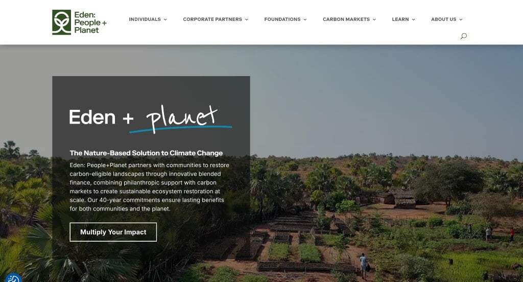
Eden Reforestation Project’s website clearly focuses on creating a layout that meshes well with their target market. We thought their use of a natural palette was smart because of what they stand for. Their logo design was also creative and memorable, which is always good to have. Including green for fonts helps their titles stand out, for sure a plus.
Ranked in our Best Non-Profit Websites Article
2. Elite Tattoo Studios
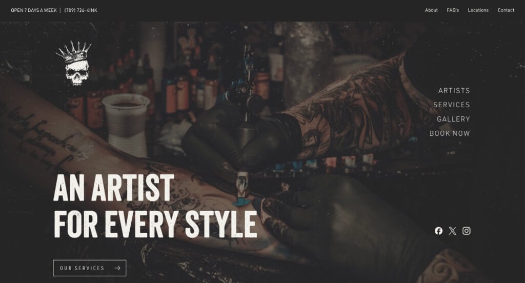
We really loved this example because of their creative font choices used throughout the template. We felt that their logo design was edgy and really matched the overall vibe of their business. Adding in lots of buttons was a smart choice to allow for smoother navigation through all their information. Keeping their paragraphs short and to the point was nice for customers to read their content easier.
Ranked in our Best Tattoo Websites Article
3. Kemora Landscapes
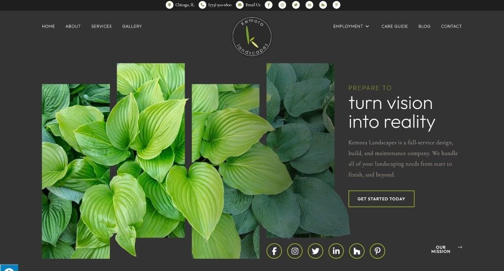
This example went with a beautiful gray and green color scheme which is logical for this business. We thought it was nice how lots of buttons were included to help guide viewers to the information that they need. We liked the balance of image and graphics in this example that creates an amazing look for their pages. Including their licenses in their footer was smart to build trust with customers.
Ranked in our Best Landscaping Websites Article
4. Oak Bros Tree Care & Removal
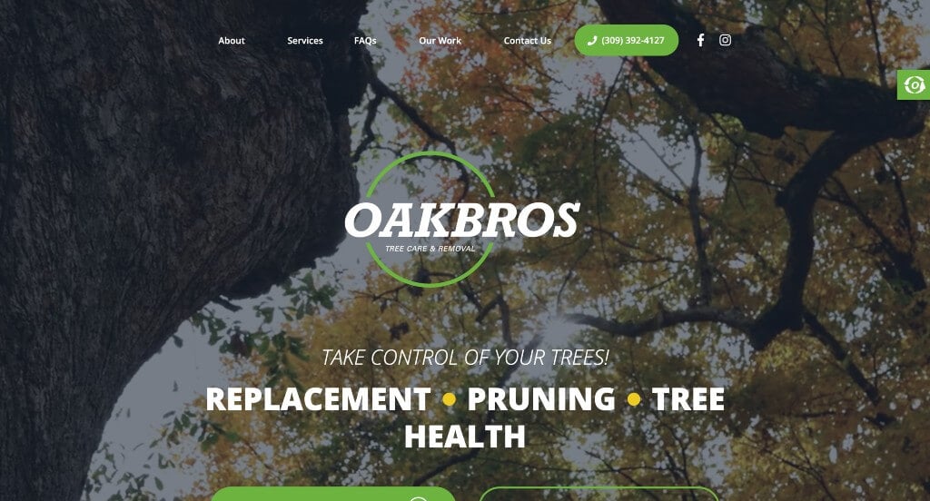
This was an example that we really liked because of their accents of green. It was both stunning and logical for their company which was something that we appreciated. They also had a logo that clearly displayed their name and was very easy to identify their brand, which is always the hope. Adding in lots of bold fonts for their titles was another thing that stood out to us.
Ranked in our Best Tree Service Websites Article
5. Sustainable 9
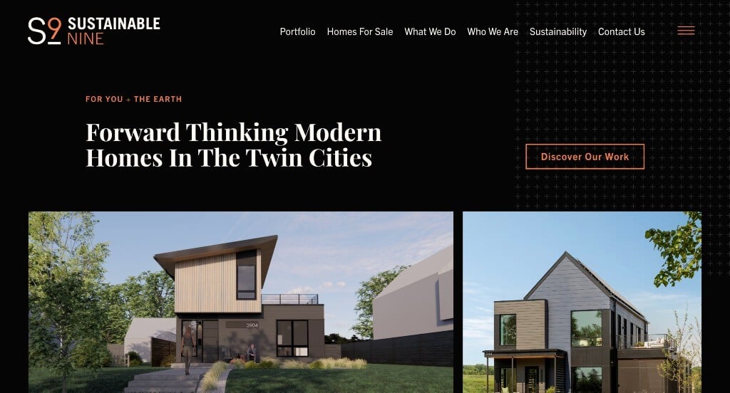
This one caught our attention because of their unique color palette. Using a black background was a nice way to create a sophisticated template. We liked their subtle patterned graphics that accent their pages. We also thought it was nice how this company used their logo as a loading icon. Including lots of images and having a web domain that matches their company were other helpful additions.
Ranked in our Best Home Builder Websites Article
6. Kinective Fitness
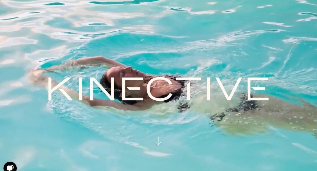
Right away in Kinective Fitness’ page we say their innovative scrolling title to suprise customers into reading more content. Their bright red accents against their normal black and white color scheme really creates a nice pop. Additionally, this template features many high quality and professional photography and typography.
Ranked in our Best Sports Websites Article
7. Bowen Electric
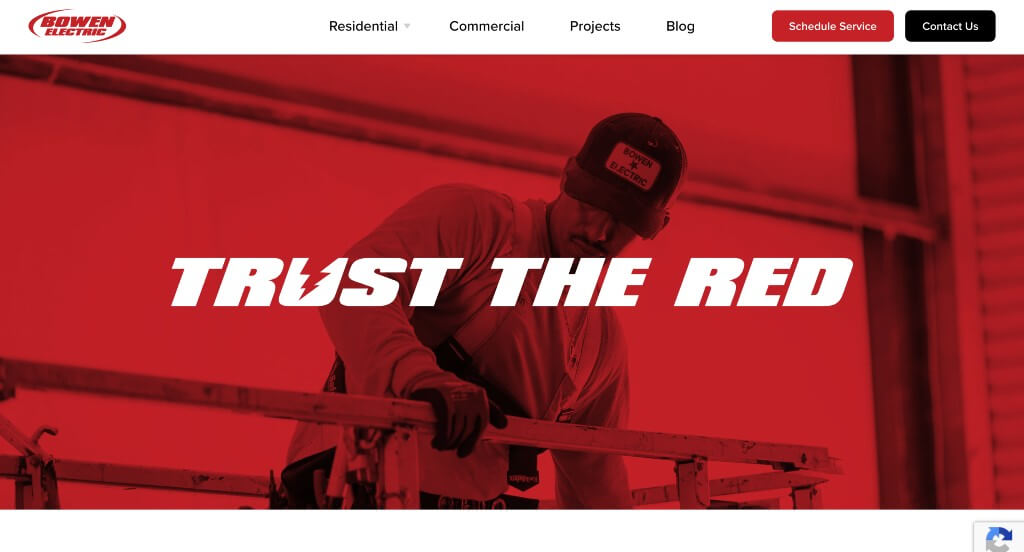
Using a catch phrase right away is a bold choice that we always appreciate. These red accents highlight their entire website, highlighting links and other important bits of information. Showing off their completed projects right on the homepage was another idea that we really liked. Including a blog was also nice because it provides information in a new way.
Ranked in our Best Electrician Websites Article
8. 6 Brothers Pest Control
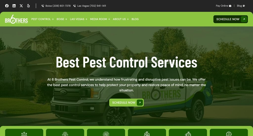
Here we have another design that makes great use of green highlights and filters which makes sense for their brand. Using lots of small icons was another thing that we appreciated because it helps move viewers eyes to the information that they need. Keeping their paragraphs short and straightforward was another nice choice to help keep viewers engaged.
Ranked in our Best Pest Control Websites Article
9. Oshkosh Corporation
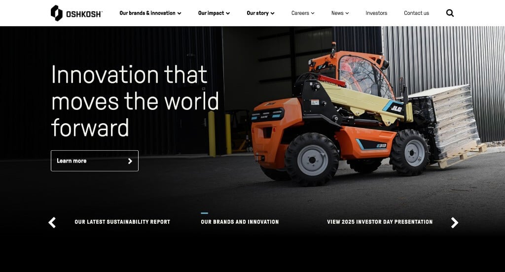
Oshkosh Corp made great use of alternating background colors to help break up content. Additionally, lots of high quality images are used in many areas of this example. It was smart to have so many links bringing customers to information. Everything in their design is extremely organized, making it easy for customers to find what they are looking for.
Ranked in our Best B2B Websites Article
10. Aurate
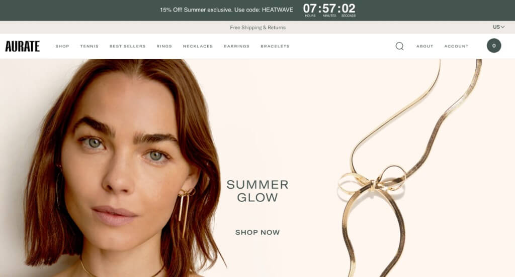
Aurate is another amazing example that we wanted to revisit. Their imagery was amazing with their dark backgrounds. Including a few things based on the current holiday was another thing we really enjoyed. Lots of sparkly diamonds are used to attract customers who like that sort of thing. Adding in short videos to showcase many of their pieces. Adding that element also allows for the true sparkle of their products.
Ranked in our Best Jewelry Websites Article
11. Baptist Health
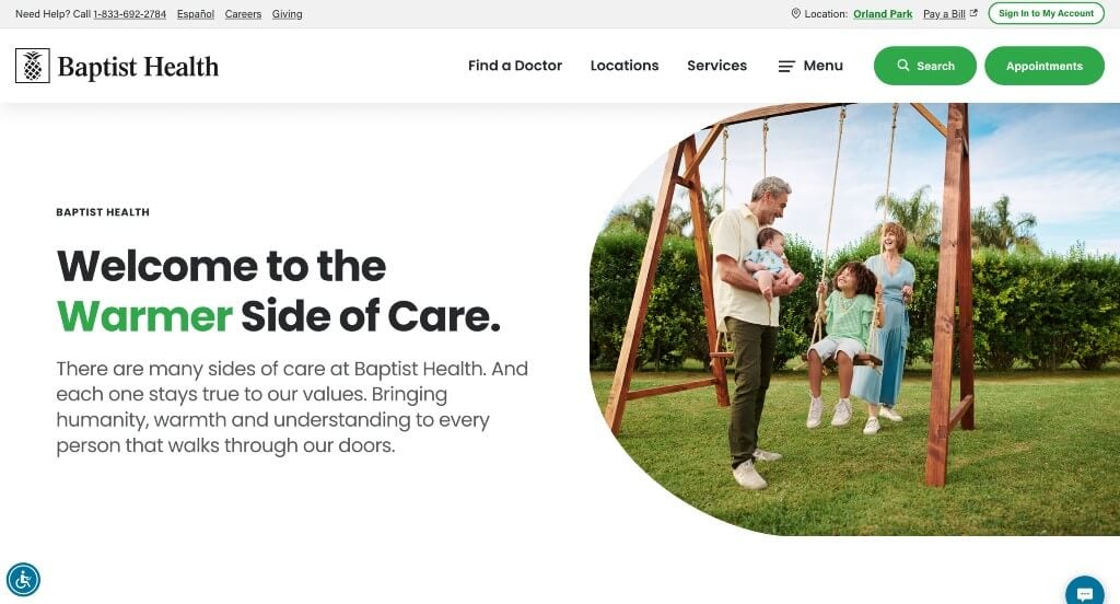
Likely one of Baptist Health’s best features was their image frames. It was even cooler because similar shapes were used as buttons and more. Here’s an example that is easy to navigate, with clear links to popular topics such as provider search, bill pay, and health resources. We really liked how their colors are subdued and professional, and everything is clean and uncluttered. Lots of links could be found to direct customers to more information.
Ranked in our Best Medical Websites Article
12. Oh
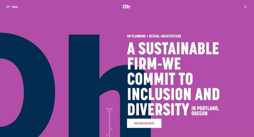
Here we have an example that uses lots of bright colors to create an unforgettable design. We liked the simple graphics that guide people downwards in their information. Showing off lots of their featured projects within the homepage was another choice that we liked. Their font was professional but very bold, making their information easier to read.
Ranked in our Best Architect Websites Article
13. Asheville Bee Charmer
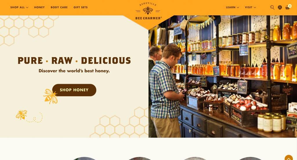
Asheville Bee Charmer created a template that is unique to their brand and we loved it. Using graphics that go along with the nature of honey bees was a brilliant idea. This color scheme was also logical for their products which is really nice. This company also did a really good job with their images that show off their products and their store.
Ranked in our Best WooCommerce Websites Article
14. Pitch Tents
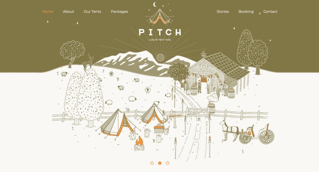
This company did a nice job with their use of graphics throughout their webpage. This was an example that really stood out to us because their color scheme was much different than their competitor sites. We liked how lots of their content was framed with a rope like pattern because it broke up lengthy information and was logical for their brand.
Ranked in our Best Ecommerce Websites Article
15. Papaya Wellness
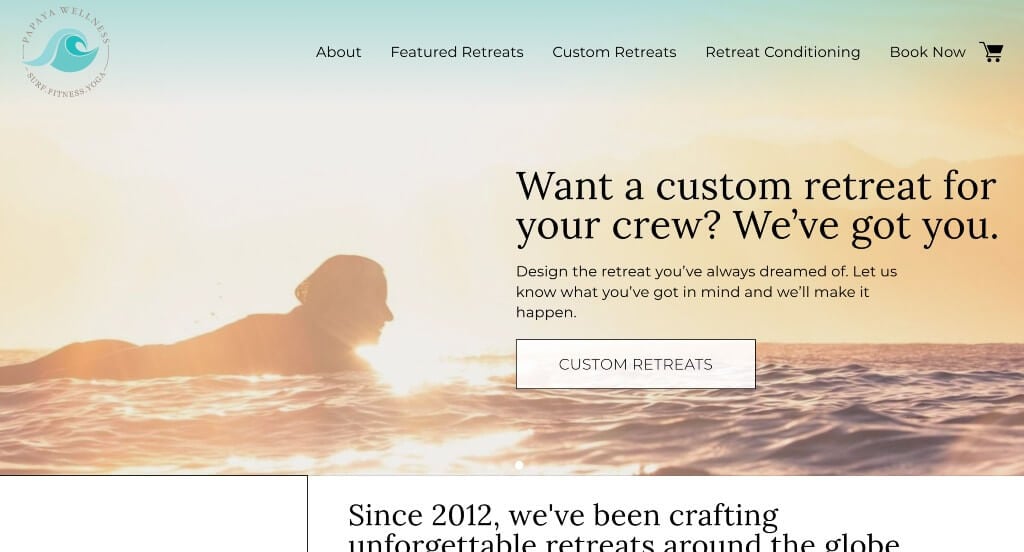
Papaya Wellness was a great example to help inspire those who are wishing for more ideas for their yoga or fitness center. We loved how there was large images that are sure to grab the attention of viewers. Along with that, we really liked how this company made use of lots of buttons to make their overall navigation faster and easier.
Ranked in our Best Yoga Websites Article
16. Dust Queen
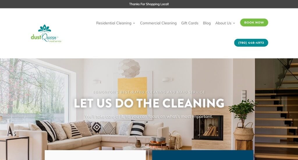
Here we have an example that stands out from other cleaning sites because their logo has nothing to do with cleaning, but is still relevant to their company. We liked the overall color scheme that has been developed for this website. Along with that, we really enjoyed how they use drop downs within their menu, making it easy for anyone to use and find information.
Ranked in our Best Cleaning Websites Article
17. The Bond Between Vet Center
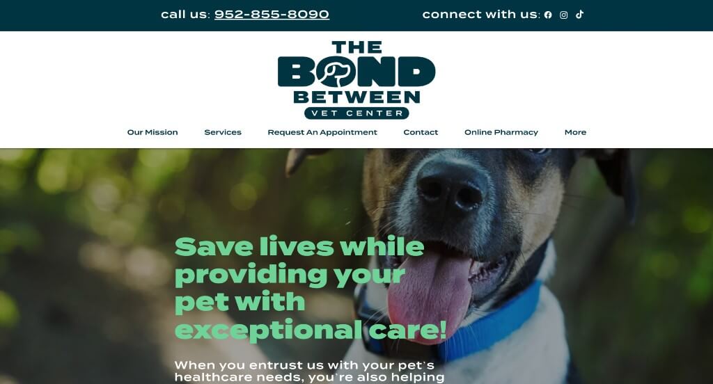
One of the things that grabbed our attention right away was this interesting logo design that is both unique and logical for their business. Adding in lots of images of happy, healthy pets was another smart idea especially because they are a vet clinic. We thought that this font choice also elevated their pages because it was creative but still very professional.
Ranked in our Best Veterinarian Websites Article
18. Nelson Global
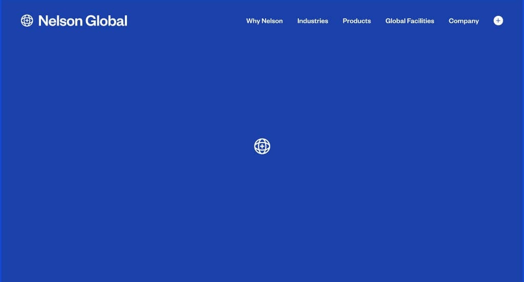
Nelson Global started right away with an automatically playing video to grab attention. They used white space very effectively which was nice because everything felt more balanced. Something else that we loved was their simple but bright blue accents. Nelson Global also does a great job with their staggered images to create an interesting template. We thought it was also nice to add in a few statistics related to their business.
First time ranking in our lists!
19. Gibbs Electric Company
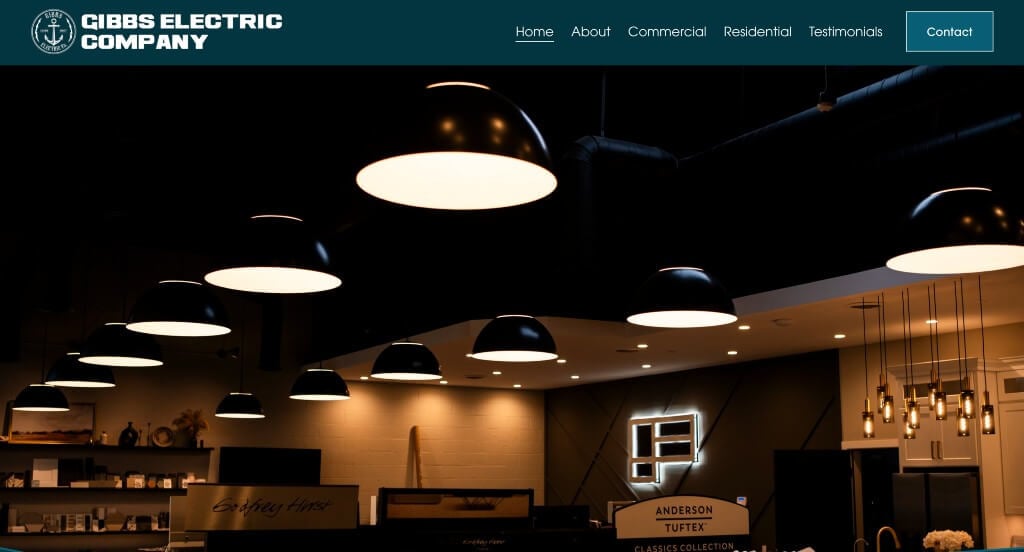
We loved this example because of their creative template that is sure to grab attention. This company also did a very nice job with their images that are high quality and extremely pleasing. We thought that their choice for fonts was another thing that helped them as a company stand out more. Reusing their logo throughout the pages was another feature that we noticed.
Ranked in our Best Electrician Websites Article
20. Solstice Acupuncture
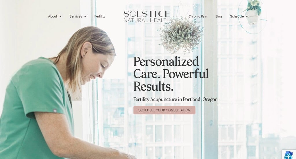
In this example, we really appreciated how their content was well balanced with white space because it felt more relaxing. Accents of yellow and pink can be noticed throughout their website to help liven up their pages a bit more. We felt that their paragraphs were written in a straight forward manner which was nice. Along with that, we liked how they had a company blog.
Ranked in our Best Acupuncture Websites Article
21. Midwest Coast Brewing
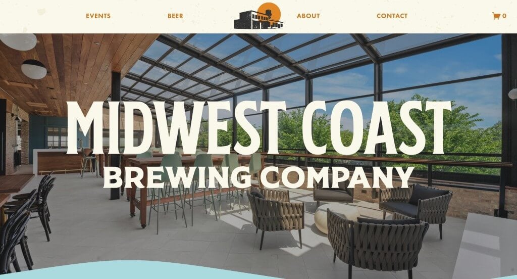
We felt that this was a very creative, interesting template that is sure to attract attention of anyone who enters the page. Something that we noticed was their appearance that feels stamped or printed to create a more small business feel. Adding in pastel colors made for a design that was much more interesting and energetic.
Ranked in our Best Brewery Websites Article
22. NOBULL
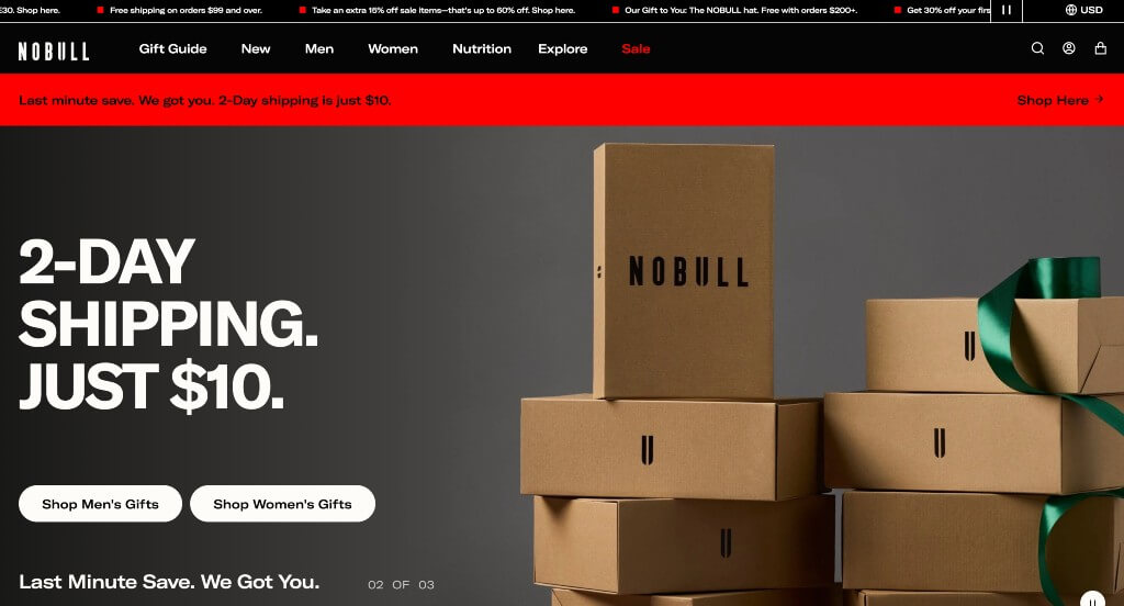
NOBULL attracts customers by displaying their brightly colored products right away in this site. It was smart to add in little fonts that show products on sale or their final sale. Showing Honorable Mentions from places such as Awwards.com was another great idea. We liked how they had an option to favorite some of their products.
Ranked in our Best Sports Websites Article
23. LARQ
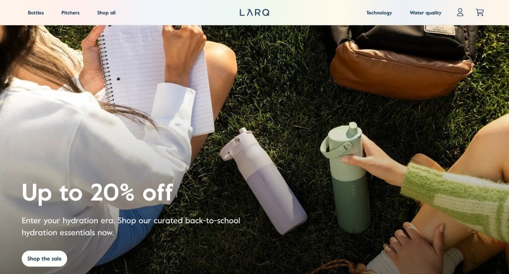
Instantly, we are intrigued by this clean and simplistic design. Their imagery also revolves around the current holiday which we thought gave a more personable feel. The colors used here is also minimal, which adds to that clean and simple feel we mentioned before. Adding in a section that showcases their customer reviews was a good touch.
Ranked in our Best Ecommerce Websites Article
24. Kettle & Fire
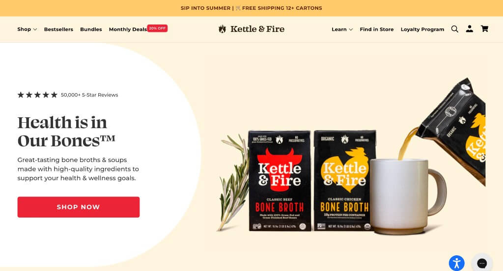
Kettle & Fire does a great job displaying their packaging which is unique for an online store. Using a few different pastel colors to decorate this example was something else we enjoyed. Aside from that, we loved their logo design that cleverly used a flame and a kettle within one design. It was helpful to have customer reviews showing verified customers.
Ranked in our Best Ecommerce Websites Article
25. Magic Spoon
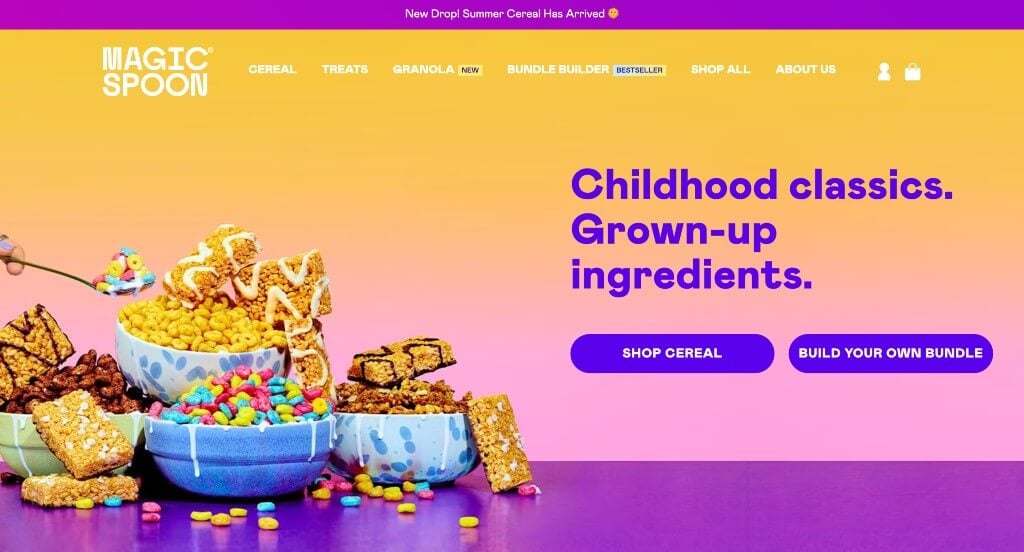
Right away, Magic Spoon grasps the attention of young children due to its bright colors. Also having spinning animations for cereal bites was something that stood out to us. Offering cereal and treat packs along with a build your own bundle helps customers feel they are getting more for their dollars. We also liked how Magic Spoon made great use of short video clips and buttons to engage customers into their content a bit more.
Ranked in our Best Ecommerce Websites Article
26. Winc
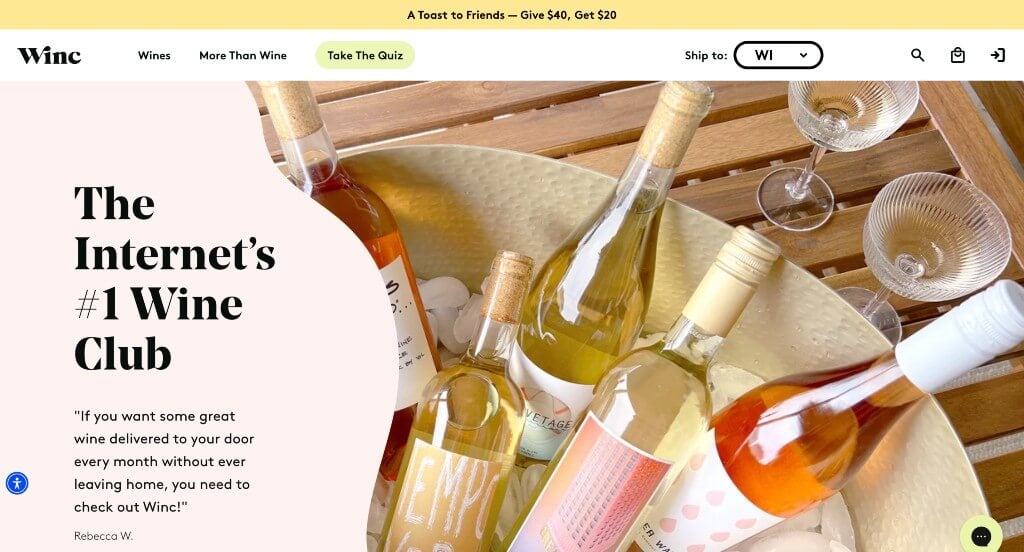
Likely our favorite part about this example was their squiggly frames and background colors that create a dun and inviting template. Additionally, we really thought Winc did a good job with their stunning packaging for their variety of wine flavors. Every one of their images was high-quality and professional looking which brings them into the next tier of web designs. Another feature that we noticed was their pop-up that asks about your age prior to opening this site.
Ranked in our Best Ecommerce Websites Article
27. Acumen
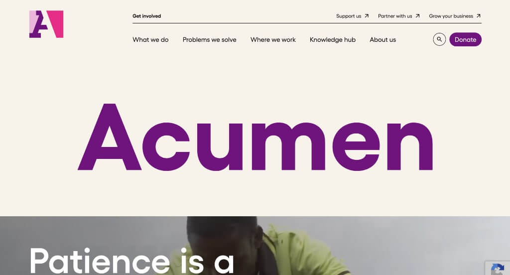
Here’s another one that really stood out to us as we moved through our long lists to pick from. We really loved their automatically playing videos. Bright color accents also help this company highlight the important areas of this template. Many high quality images also improve visual aspects of this design. Acumen’s logo design made use of white space to have an interesting look. Finally, everything is written in nice short paragraphs so people can read it easier.
Ranked in our Best Non-Profit Websites Article
28. Fishing The Feed
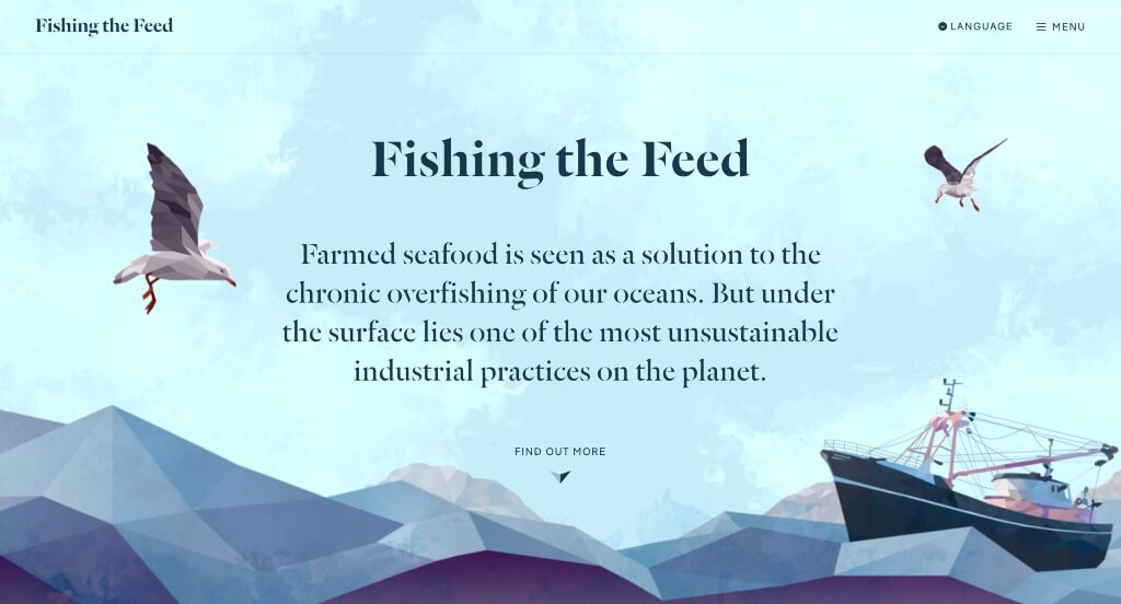
We loved this example because of their unique graphics that appear throughout their pages. They picked out interesting fonts which we also liked because it creates a brand identity. This example has lots of fun transitions and animations which was another reason that we were drawn to it. Including lots of call to actions near the end of their site was another smart choice.
Ranked in our Best Interactive Websites Article
29. The Blonde Abroad
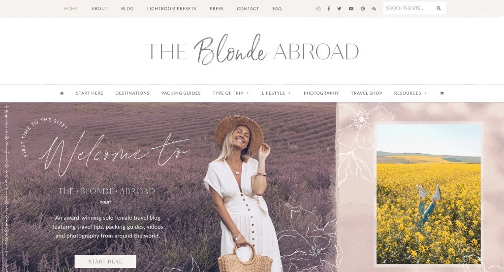
Every inch of this template was oozing with creativity. We loved the font choice for this example because it created a feeling of delicate beauty. Adding in lots of interesting graphics was another choice that we really appreciated. We thought it was interesting how they made their pages feel almost like a scrapbook without it feeling messy. We appreciated their inclusion of a map that shows where this blogger has traveled and where she is now.
Ranked in our Best Blog Websites Article
30. The Sun Grove
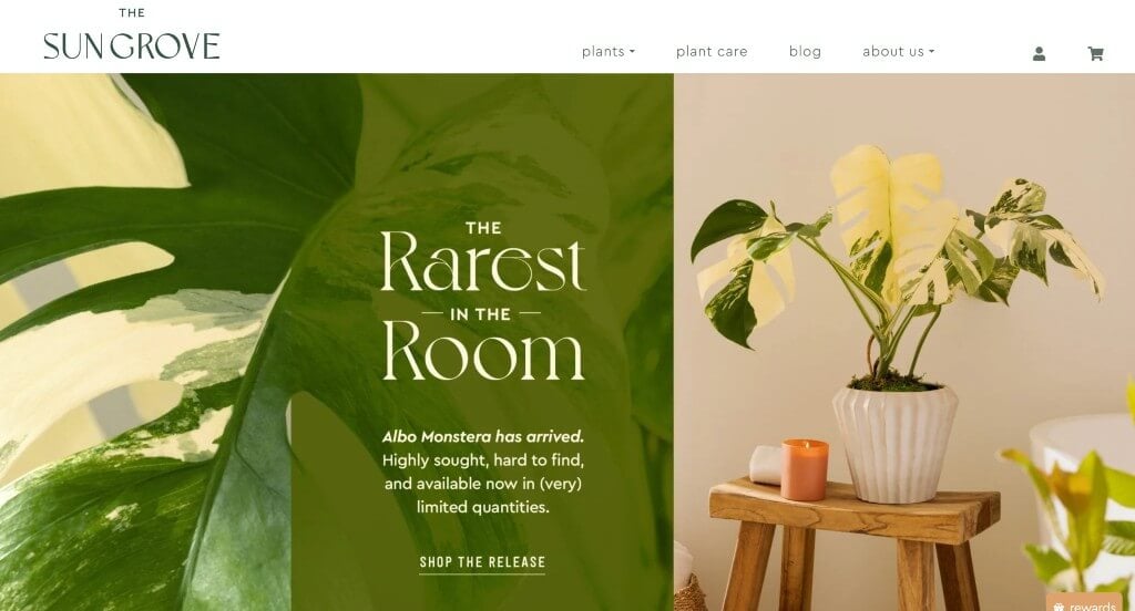
Here we have an example that makes it obvious right away what they sell. Their fonts are professional and unique helping their overall feel original to their brand. Using cream alongside green colors made a webpage that was logical for their brand but also relaxing. This company also did a nice job with their web domain that matched their business name.
Ranked in our Best Florist Websites Article
31. The Ridge
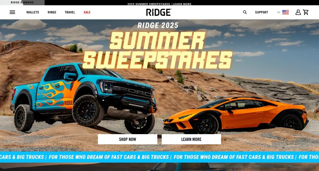
The Ridge clearly showcases who they are and their simplistic but modern products. Creating a logo with angled edges allows for a unique look that seems to match their company. Sorting everything so customers can shop by the specific thing that they are looking for is really nice. Having football and baseball team items that will attract customers who are fans. We also thought it was a great choice to pick a domain that matches their business name.
Ranked in our Best Shopify Websites Article
32. Black Diamond
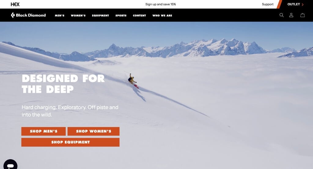
Black Diamond is sure to make an impact with their bold fonts and basic backgrounds. Adding in small splashes of orange color was helpful to create a stunning design. Though their logo design is simple, it’s memorable and makes sense for their brand. Having lots of buttons was a choice that was extremely smart. We also noticed how there was a search bar within their design.
Ranked in our Best Ecommerce Websites Article
33. Behind The Shutter
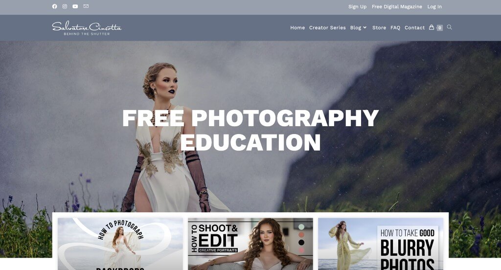
This example did an amazing job showing off their creative imagery. This was a great selling point because the blog is focused around being a better photographer. Being able to blend images with typography was a skill that this business has down for sure. We liked their inclusion of videos to provide information in a new way for those visual or auditory learners.
Ranked in our Best Blog Websites Article
34. Streetbird NYC
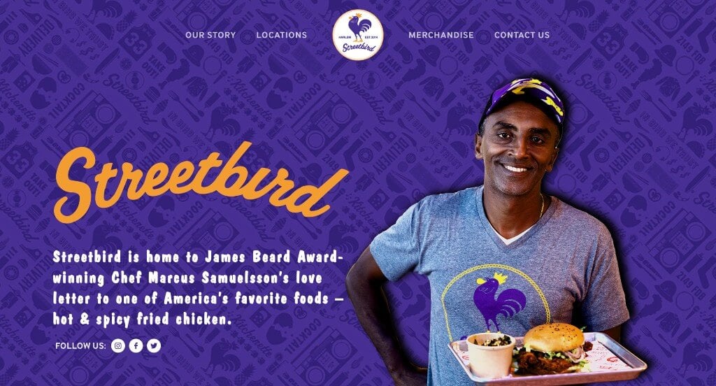
Streetbird was an example that inspired us because of their patterned backgrounds that look amazing. Their color scheme was one that we don’t see often which makes us appreciate it more. Using interesting catch phrases throughout the pages was another choice that we really appreciated. Another thing that we loved about this example was their font choice that people will be sure to notice.
Ranked in our Best Restaurant Websites Article
35. AllBirds
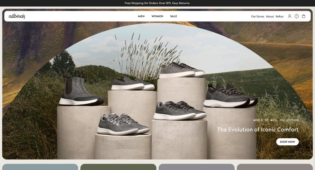
We really do think this site is a winner in the web world. Allbirds has outstanding imagery that is unique and simple, but manages to still show off their product. We love how they have a well-labeled menu that makes their content nice and organized. A simple domain was another great choice that will always help out a company like this one.
Ranked in our Best Ecommerce Websites Article
36. Secrid
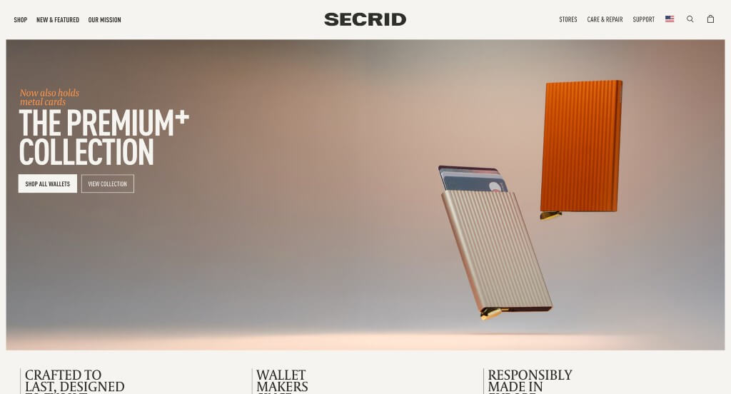
We really liked how as viewers scroll down, the company name goes into the site’s search bar. This color scheme is very basic but follows a very natural feel. We liked how their products had little animations upon hover. As you scroll through, you’ll find there’s lots of white space but it’s filled with large product images. Small graphics are found to be used as a bit of visuals. This is a great website to gain inspiration from.
First time ranking in our articles!
37. Tillamook
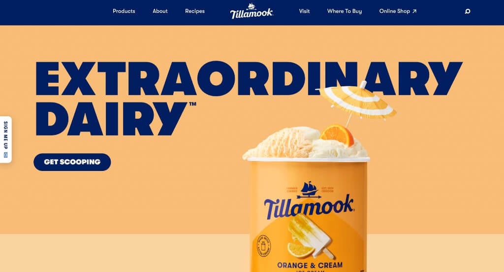
High quality visuals is our favorite part about this example. Their creative packaging was displayed well which was a good choice because of how it stands out from their competitors. We thought even their brand name was a plus because of its uniqueness. As you scroll through, you’ll gain an understanding of their company, culture, and products. Even this footer has a minimal, yet appealing design to it.
First time ranking in our articles!
38. Travel Nevada
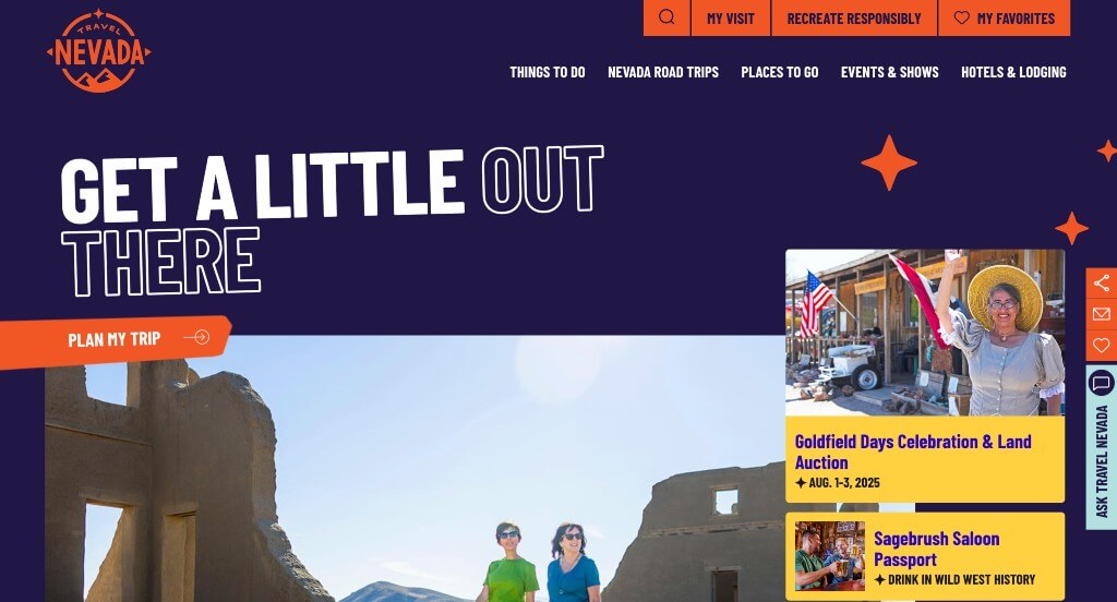
This made it on our list of favorite websites because of their blend of graphics that really breathe life into their page. We loved the color scheme that was used for this company because it felt unique to them. Using large and bold fonts really attracted attention to the information that is most important which is a great choice. We also felt that this navigation bar was well labeled making it easy to find information.
Ranked in our Best Tourism Websites Article
39. Flour Bakery
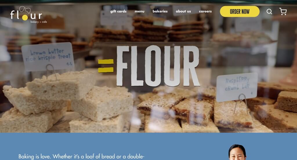
This was an example that we really loved because of their creative graphics. Using a beautiful color scheme was another choice that we really appreciated. Automatically playing videos helped engage viewers right away so they are interested in the content from the start. Reusing their logo in a variety of places in a different way was a great way to strengthen their brand identity.
Ranked in our Best Bakery Websites Article
40. Beachly
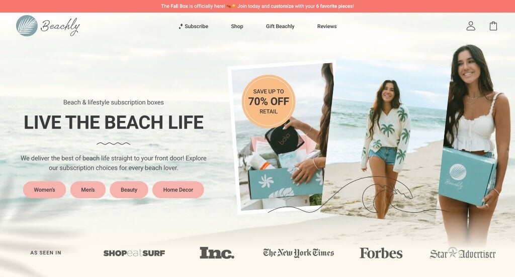
This example does a great job creating a theme for their brand that really blends well with their company. Using both stunning colors and interesting graphics to create that beach vibes feel was something that was executed perfectly. Along with that, we enjoyed that their were lots of buttons and linked images that could guide viewers towards additional information.
Ranked in our Best Subscription Websites Article
41. Explorateur Travel
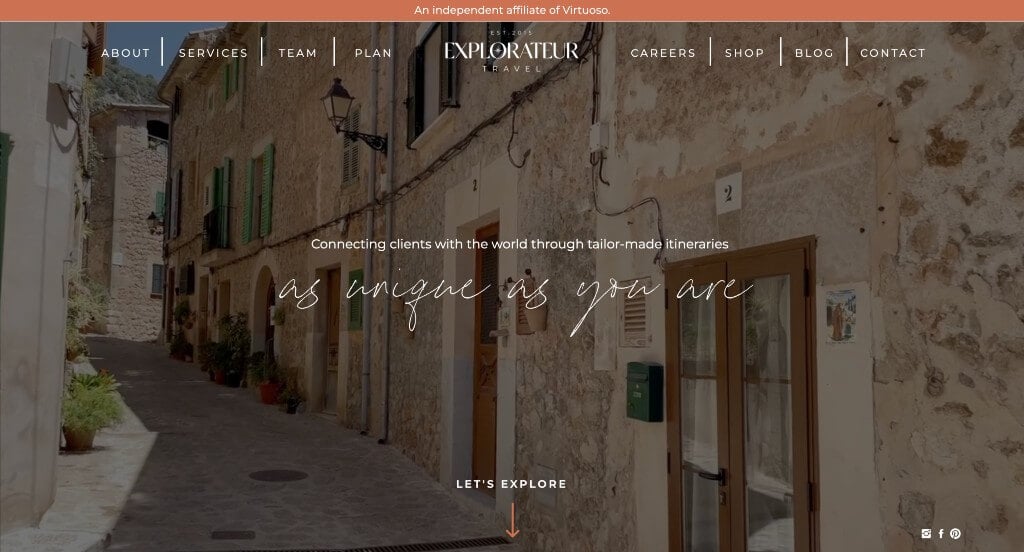
This was an example that grabbed our attention because of its beautiful font choices. We thought it was nice how accents of orange appeared throughout the pages to highlight information and links. Keeping paragraphs short was a great way to get viewers involved and stay engaged with their information. Their web domain also matched the company name which is always nice.
Ranked in our Best Travel Agency Websites Article
42. Hotel Garden Downtown
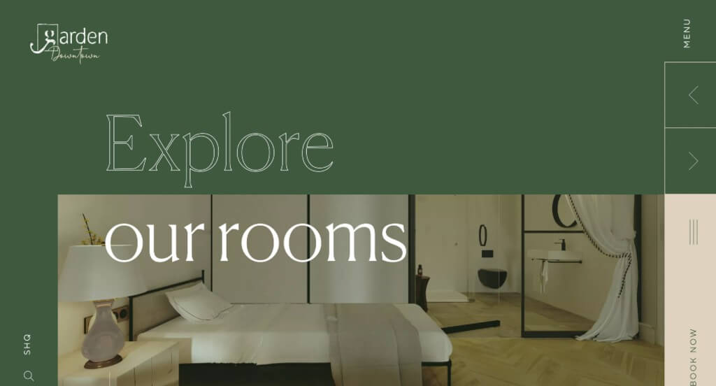
Here we have a template that stands out because of their large fonts that are used in a unique way. Images are large and balanced well so their pages never feel overwhelming. Including information about their very own restaurant was another choice that we appreciated. Adding in a search bar was something else that we noticed.
Ranked in our Best Hotel Websites Article
43. Clement & Co Events
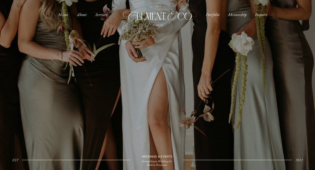
Clement & Co Events grabbed our attention right away with their large images that showcase a variety of different weddings. We felt that this company did a very nice job balancing their information and whitespace so their pages never felt cluttered or empty. Including lots of wedding brands that have featured their company was a great way to build trust with new clients.
Ranked in our Best Wedding Websites Article
44. DD NYC
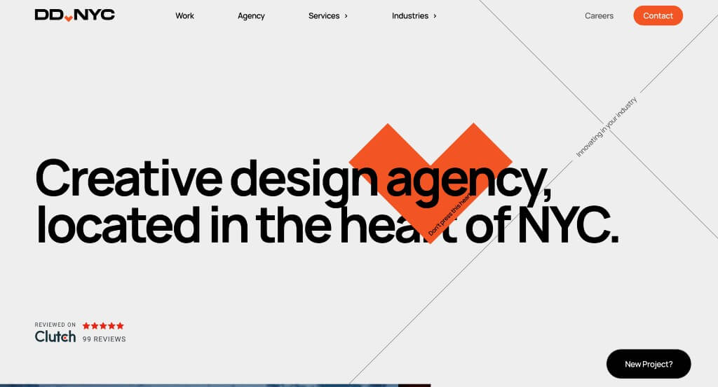
Here we have an example that is sure to be enjoyed because of their interactive animations that appear throughout the design. Including some of their more notable clients in a slideshow was a great way to show off that they are a well known brand. Including statistics about their company was another way to get customers excited about working with them.
Ranked in our Best Web Design Websites Article
45. Sweet Mae’s Cookie Company
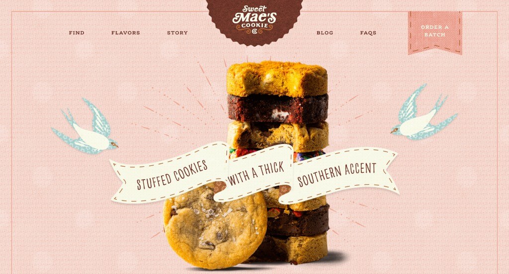
This was an example that we will bring up whenever we can. This company did an amazing job creating a website that can only be identified as theirs because of their creative scrapbook feel. Their fonts are creative and memorable which looks stunning for their company. They also do a great job including buttons to guide viewers towards more content.
Ranked in our Best Bakery Websites Article
46. Ashley Smith Photos
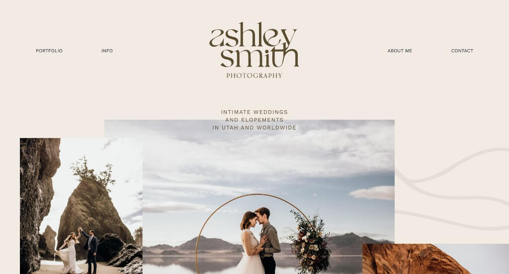
We loved this example because of their fonts that speak volumes. Adding in a few accent graphics throughout the pages really elevated the look for their whole brand. Overlapping images created a look that felt more like a creative arrangement than a corporate design. Including a variety of blog posts with additional information was another choice that we appreciated.
Ranked in our list of Best Photographer Websites Article
47. La Luz Weddings & Events
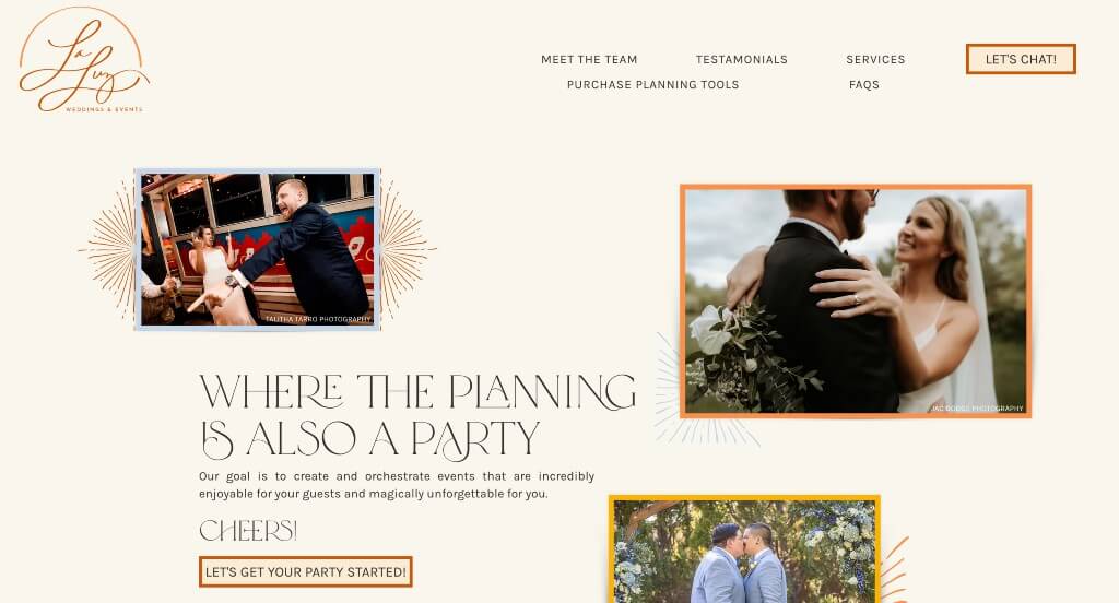
We loved this wedding website example because of their creative photo frames that are sure to grab attention. Along with that, we liked the simplicity of their layout because it makes it less overwhelming to scroll through. Plus, we really liked that their fonts were creative and easy to read. Adding in lots of buttons were also quite helpful to create easier navigation.
Ranked in our list of Best Wedding Websites Articles
48. Jot
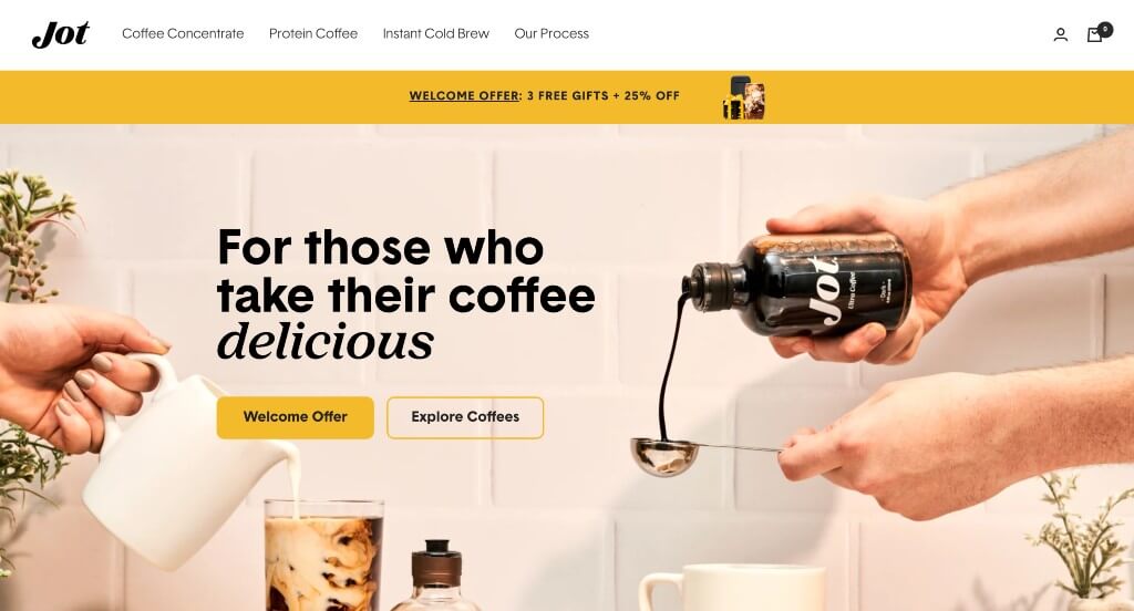
Jot certainly takes advantage of colors and imagery to give off a relaxed coffee enthusiast vibe. We loved how there was short animations related to their business to add a bit of interest. They also made sure to use a simple and professional font that looks amazing. Another thoughtful feature was their prices that utilize the strikeout feature to show current discounts. For anyone looking for design styles that relate to coffee websites, this is one to review for sure!
First time ranking in our list!
Need a Website That Stands Out Like These?
Our web design team has helped hundreds of businesses launch stunning, high-performing websites.
Explore More Top Website Designs by Industry
To help inspire you for your upcoming project, we’ve curated collections of top-quality sites by CMS, layout, and industry.
These articles will help you explore web design strategies and aesthetics, offering insights into creating engaging user experiences.
Best Website Designs by Platform
A website’s look isn’t defined by its CMS or platform, but many ask for top sites built on specific platforms – so start with these examples!
Best Web Designs by Layout Type
Focus beyond just your homepage – conversion paths often start on other landing or product pages. Make sure to prioritize design and user experience throughout your entire template.
The articles below discuss visual elements to look out for when building exceptional web pages.
Best Examples by Industry
Another common ask is to see examples of perfected sites in their competitive space. We’ve got almost every business sector covered, so don’t hesitate to check them out!
Professional Service Web Designs
If you are in the professional services industry, don’t be afraid to get creative on your next website design by looking into some of these exciting examples.
Construction & Home Service Web Designs
Top-performing home service layouts tend to prioritize lead generation, so they often feature contact forms, service area maps, discounts, reviews, and schedulers.
We’ve tried to find websites that do a great job of incorporating these lead generation design elements into their websites. Find some examples below!
Health & Medical Website Designs
Most health web pages tend to lean towards a clean-cut, professional website layout. However, we were able to find several that think out of the box.
Food & Beverage Website Designs
We’ve found hundreds of mouthwatering examples related to food & beverage for you to review!
Other Website Designs
Not finding what you’re looking for? Explore some more stellar designs, organized by industry, for your inspiration!
- 50 Best Corporate Websites
- 50 Best Small Business Websites
- 50 Best Manufacturing Websites
- 50 Best Industrial Websites
- 50 Best Non-Profit Websites
- 50 Best B2B Websites
- 50 Best Church Websites
- 50 Best Consultant Websites
- 50 Best Information Websites
- 50 Best Wedding Websites
- 50 Best Subscription Websites
- 25 Best City Websites
- 40 Best Woodworking Websites
- 47 Best Dispensary Websites
- Top 24 Computer Repair Company Websites
- 38 Best Auto Dealer Websites
- 52 Best Hotel Websites
- 47 Best Finance Websites
- 28 Best Funeral Home Websites
- 41 Best Mortgage Broker Websites
- 50 Best Auto Repair Websites
- 50 Best Hair Salon Websites
- 50 Best Daycare Websites
- 25 Best Tattoo Websites
- 50 Best Sports Websites
- 50 Best Jewelry Websites
- 50 Best Photographer Websites
- 50 Best Travel Agency Websites
- 50 Best Fashion Websites
- 50 Best Museum Websites
- 50 Best Software Websites
- 50 Best Tourism Websites
- 46 Best Florist Websites
- 45 Best Automotive Websites
- 20 Best Artisan Websites
- Top 47 Agricultural Sites
- 20 Best Web Design Companies
- 45 Best Staffing Agency Websites
- 41 Best Catering Websites
- 24 Best Limo Websites
- 49 Best Self Storage Websites
Did we miss an industry? If so, let us know in the comments so we can find some more amazing examples!
Recommended Website Themes
Here is a collection of themes you might consider using to start a new website:
WordPress Themes
You can find free themes at wordpress.org, or consider options through marketplaces like ThemeForest.
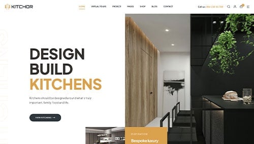
Kitchor – Themeforest
$49
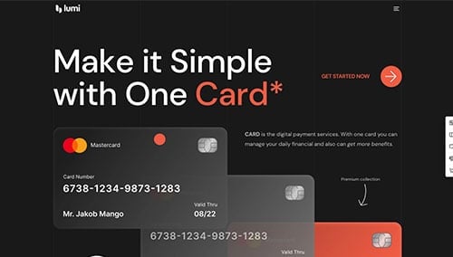
Lumi – Themeforest
$59
WooCommerce Themes
You’ll find plenty of themes for WooCommerce on ThemeForest.
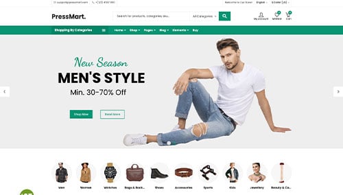
PressMart – Themeforest
$35
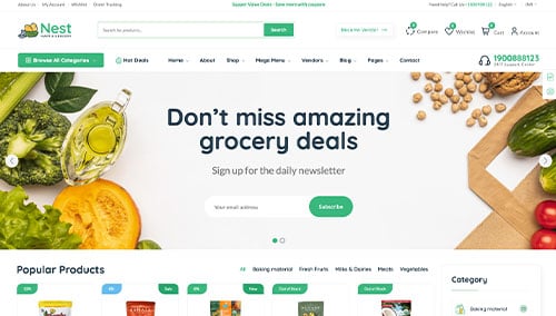
Nest – Themeforest
$39
Shopify Themes
You can find free and paid themes at themes.shopify.com, or consider options through marketplaces like ThemeForest.
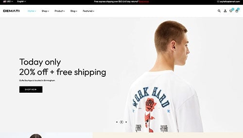
Demati – Themeforest
$48
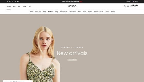
Unsen – Themeforest
$69
BigCommerce Themes
You can find free themes at bigcommerce.com, or consider options through marketplaces like ThemeForest.
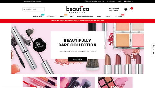
Beautica – Themeforest
$139
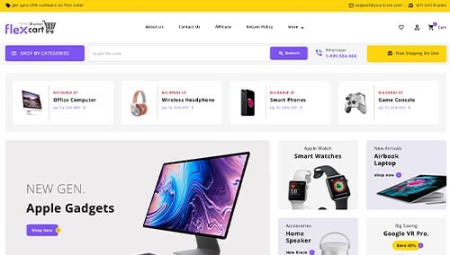
FlexCart – Themeforest
$99