In today’s digital world, having a well-designed website is essential for businesses and individuals alike. A great website not only helps to establish a strong online presence, but it also has the potential to captivate and engage visitors.
For those looking for inspiration for their next website design project, it can be helpful to see examples of websites that have been designed and developed with care and attention to detail.
To that end, we’ve evaluated and ranked the best websites we could find based on the quality, uniqueness, and functionality of their website designs. Our web design agency reviews dozens of websites per day, so over the course of 20+ years in business that is a lot of websites!
Whether you’re a small business owner, a freelancer, or an individual looking to create a personal website, this list of best websites is sure to provide you with a wealth of ideas and inspiration. We hope this article helps you bring your web design ideas to life!
Our Top Ranked Websites of 2024
1. Eden Reforestation Project
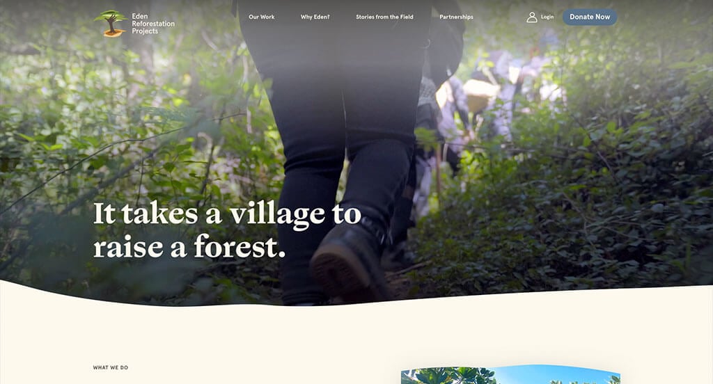
Over the years, the Eden Reforestation Project has planted over 977 million trees worldwide throughout 10 different countries. The organization also succeeds in empowering more than 14,800 local employees with fair wages, sustaining both the people and the planet.
The video on the homepage stands as a testimony to the organization’s achievements while also serving to introduce and engage the visitors with its story. To enhance its message, the website also utilizes warm earth tones for its typography which nicely match the colors of its images. All of this entices the visitor to continue scrolling so that they can continue to learn more about the tremendous achievements that the team over at Eden Reforestation Projects has made over the years.
No matter where you are on the website, the sticky header provides an easy way for the website’s visitors to donate to the cause. Regardless of whether you are learning about their methodologies in the “Why Eden” section, if you’re engaged in the Stories from the Field section, or if you’re learning more about each of the many leaders in the Leadership section, you are sure to be pleased by the design. These are just some of the reasons we included this website in our list of the best website designs of the year.
Ranked in our Best Non-Profit Websites Article
2. UPLIFT
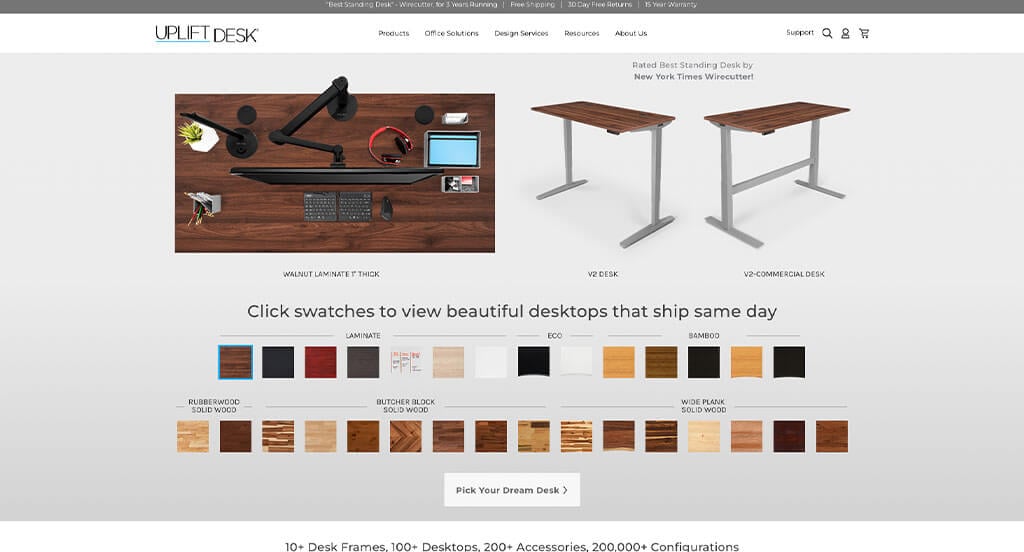
One of our favorite ecommerce websites is Uplift Desk. Uplift Desk is a business that offers a wide variety of standing desks for people who want to improve their posture during long workdays. Right from the get-go, they give you exactly what you came to the site to explore – the first step of their highly customizable desk building process.
We thoroughly enjoyed going through the customization process as each selection you make towards building your own desk will automatically reflect in the image on the screen. This is very convenient for the user as they can see in real-time what they’re doing while also building confidence that the desk will arrive at their home or office exactly the way that they want it.
They also provide many customer reviews and photos on their homepage to instill in the visitors both confidence in the brand and inspiration towards the customization process. Uplift Desk also proudly displays that they’ve “uplifted” almost all the Fortune 500 companies.
We also loved how clear and accessible the navigation was throughout this site, especially for how many different pages and products they have. There were just so many parts of this website to love when ranking it for inclusion in our list of the best website designs. Make sure you check out Uplift Desk if you need inspiration for your next website.
Ranked in our Best BigCommerce Websites Article
3. Field Edge
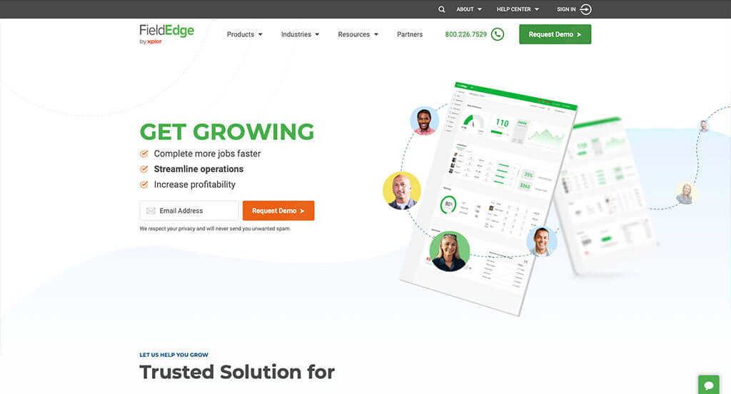
Next up is FieldEdge’s website. FieldEdge offers an all-in-one solution software solution to small & large trade businesses for anything from project management, customer relationship management, quoting, invoicing, service agreements, scheduling, dispatching, and more.
You can tell someone spent a great deal of time working on FieldEdge’s website, which helped convince us of its placement in the best website designs to recommend. Not only is it only easy on the eyes, but every inch of the main page is highly utilized. For starters, the graphics and colors they use throughout the site make you feel like the software they provide is going to free up your life, increase your profits, and streamline your business without any more effort from you than clicking the button to request a demo.
We also deeply appreciate any website that tastefully utilizes scroll animation. Scroll animation is a great tool to use to increase visitor engagement and reduce bounce rates by continuously introducing new content in a fun and exciting way.
The sticky header and footer also pair well with the site as they provide the visitor with an easy way to request a demo, learn more, or engage in the integrated online chat support.
If you have a SAAS product and are looking to build a great website to showcase your software, then FieldEdge’s website can be a great source of inspiration for you when you begin discussing your design ideas with a web developer.
Ranked in our Best Tech/IT Websites Article

4. CBH Homes
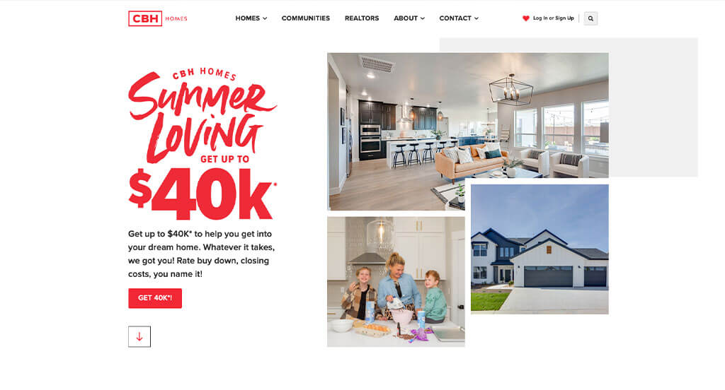
CBH Homes is a professional team of home builders, with flair! In fact, they make most of their many competitors look boring in comparison. Their website is both elegant and exciting, featuring red & black typography that is accentuated by a sea of negative space.
One subtle design feature that we love about their website is the use of light greys over the white background. This succeeds in adding character to the site without taking away the focus from the main talking points that they have to offer.
Speaking of main talking points, you’ll often see websites feature a section with three to four high contrasting icons with text and buttons below it. CBH Homes takes this section to a whole new level by adding hover effects that gray out the columns that you aren’t hovering on while simultaneously introducing related images.
CBH Homes also succeeds in meeting the basic requirements that we’re looking for in great websites, like offering live chat functionality, sticky headers with high contrast CTA buttons, and easy & clear navigation throughout their entire site. It was an easy decision to include this website in our list of the best web design ideas of the year.
Ranked in our Best Home Builders Websites Article
5. The Smokehaus
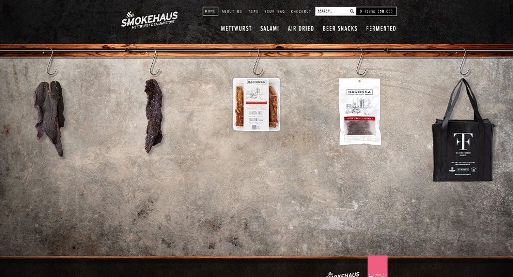
The Smokehaus is an Australian-based online store that specializes in selling smoked meats and meat-smoking products.
Many avant-garde web designs use cutting-edge design characteristics to dazzle & impress visitors. However, these interesting features can often be met with confusion as they stray away from the functionality that the general public may be used to seeing. The developers of the Smokehaus website have preemptively included a splash page to educate the visitor on how to use the website more effectively.
An interesting design characteristic this website uses is a sideways scrolling feature, which makes it easy for mobile visitors to view their products. Another unique design characteristic is a wooden plank image as the divider between the header and the body of the site.
Ranked in our Best WooCommerce Websites Article
6. Kinective Fitness
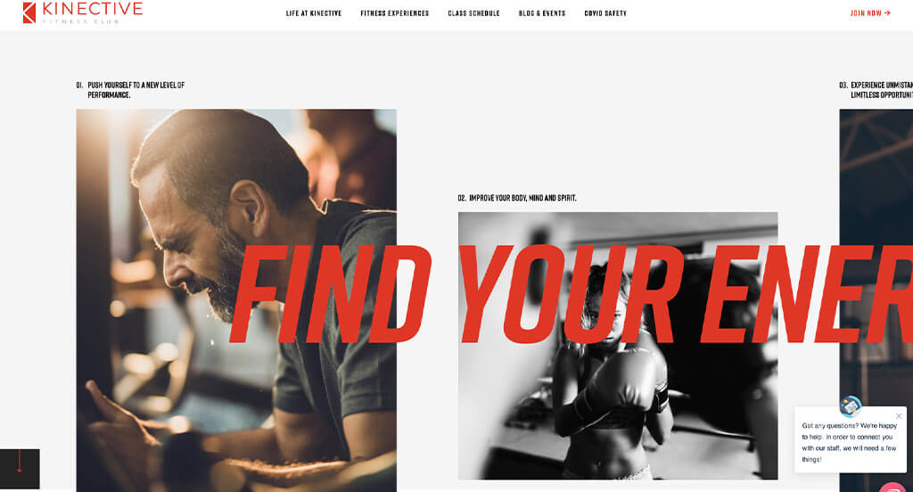
Kinective Fitness Club’s website is next on our list of the best web designs we’ve found this year. They’re a world-class fitness facility located in Texas with an equally world-class website!
As we’ve said before in this article, there’s no better way to get us excited about a website’s design than by including an instance of scroll animation! This website does so on the homepage by including sideways scrolling. This is when you scroll with your mouse’s scroll wheel, but rather than moving down or up through the page, you’re transported left and right! Pretty neat stuff!
Beyond the fancy side-scrolling section, Kinective Fitness Club’s website features great use of photography and typography. It all meshes well with their business’s message “Achieve the healthiest, happiest you.”
Ranked in our Best Sports Websites Article
7. Lillian Wu Studio
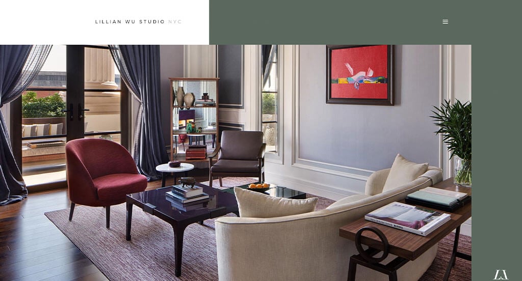
Lillian Wu Studio is a design firm located in New York City that specializes in a variety of design frontiers, including interior architecture, design development, product design, and more. If their website is any indication of the quality of their work, clients of the firm should rest easy as they are in capable hands.
The visitor is pleasantly greeted with a unique, above-the-fold section featuring an image of a room their firm has designed. The image is bordered by a subtle off-white that connects asymmetrically to a sage green with typography that compliments each background color respectfully.
The Lillian Wu Studio’s website has an overall soft yet bold appeal to it that would serve well as a jumping-off point for a conversation with your web developer.
As the visitor scrolls, they will encounter a video section that engulfs the screen. Upon further scrolling, the video section sticks to the screen while an overlay of services continues to rise to the center of attention. Such a masterpiece of a website – it was a simple decision to include this one in our best web design ideas of the year.
Ranked in our Best Interior Design Websites Article
8. Handel Architects
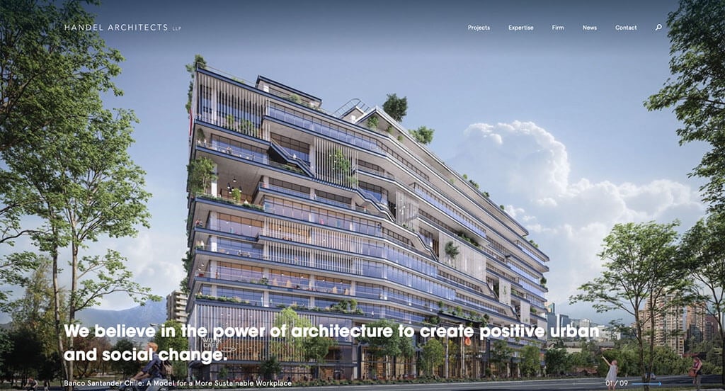
Handel Architects LLP’s website is next on our list of the best website designs. This is another instance of a website that utilizes its above-the-fold section incredibly well. The visitor is met with a series of huge images of the works from the architect firm, clicking anywhere on the image will take you to the next image.
A unique trait that sets this website apart from the rest is its use in laying an image on top of another image. Then when the user hovers over each image, that respective image will be brought to the forefront while the image that is not hovered will fall to the back.
It is also apparent that the website’s developers are quite attentive to detail. This attention to detail shows itself in the sticky header as it only “sticks” when you scroll up. This style of sticky header is often utilized by the designer when they want to maximize viewable space when the site is viewed on a mobile device. A normal sticky header can be cumbersome and can detract from the body of the website.
Ranked in our Best Architect Websites Article
9. Oshkosh Corporation
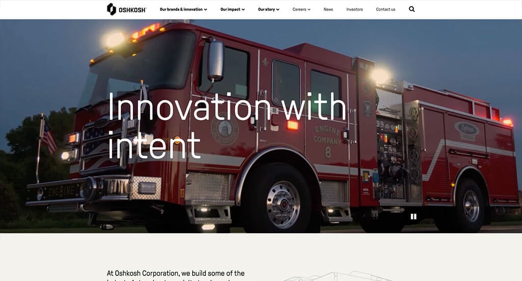
Oshkosh Corp is a proud company that builds and designs vehicles for a large variety of agencies in both the government and private sectors throughout the world. The company not only provides great innovation in its products, but they also offer a great user experience when viewing its website.
When the visitor first lands on the website, they’re greeted with a video displaying some of the company’s best-known products, as well as sneak peeks of their upcoming innovative solutions. The hero video sections don’t stop there though since Oshkosh Corp uses a different video for each of its interior web pages.
We would also like to shine a light on the navigation menu. For a company that has so many different branches, the developers of this website did a fantastic job at organizing everything in an easy-to-understand manner.
Be sure to take note of this website if you’re looking to build an amazing site that will display your engineering technology in an easy and engaging way.
Ranked in our Best B2B Websites Article
10. Aurate
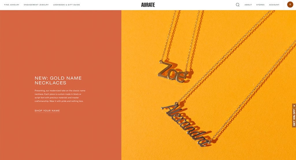
Aurate is a company that sells fine jewelry through its website. Upon visiting, you’re greeted with an interesting twist on a classic design, as they use a 40/60 split in their above-the-fold design. This is a layout more commonly seen in product pages than homepages.
They use a combination of green, gold, and white to highlight both their jewelry and their talent. Aurate also does a great job utilizing their homepage for showcasing details about their company and introducing some of their top products.
One feature we enjoy seeing on an ecommerce site is lifestyle image displayed when the visitor hovers over product images. It helps visitors envision the product on their own person, rather than just letting the product exist in a void of whitespace. This is often a step ecommerce stores skip as it requires models and photographers skilled in displaying products.
Ranked in our Best Jewelry Websites Article
11. Baptist Health
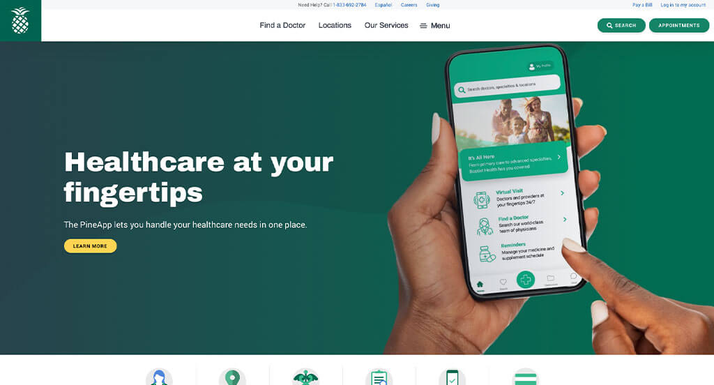
The Baptist Health website is a well-designed medical resource providing a wealth of information for patients and families. The site is easy to navigate, with clear links to popular topics such as provider search, bill pay, and health resources. The color scheme is subdued and professional, and the overall design is clean and uncluttered. It was an obvious choice as a recommendation as a best web design.
The color palette is warm and inviting, and the overall design is clean and modern. One unique feature of the site is the “For Professionals” section, which offers resources and tools for medical professionals.
Overall, the Baptist Health website is an excellent example of a medical website and will be a valuable resource for anyone looking to build a similar website.
Ranked in our Best Medical Websites Article
12. The Dallas Mavericks
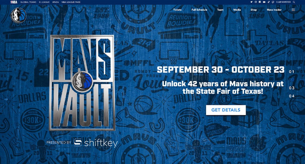
The Dallas Mavericks’ website is clean and straightforward, with a dark blue and white color scheme designed to get fans excited about their favorite team!
The website is well organized and easy to navigate, with clear links to the team’s social media accounts, the team’s full schedule, the pro shop, tickets, and more. It is clear to see the photos on the website were professionally taken and of high quality. Equally well done are the motion graphics their videographers produced. The graphics are even beautiful and user-friendly, with plenty of information about the team available for visitors and seamlessly flow together.
The Dallas Mavericks’ website is an excellent example of a well-designed WordPress site, making it a great addition to our best website designs article.
Ranked in our Best WordPress Websites Article
13. KBDfans
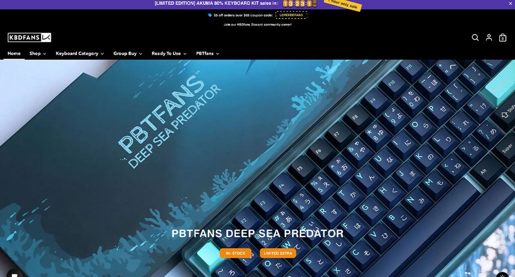
KBDFANS is a boutique mechanical keyboard manufacturer that allows you to customize a keyboard setup to your liking.
The KBDFANS website shares in the sleek and elegant design language that is synonymous with their keyboards. Scrolling through their homepage will make it quickly evident how deep you can go in the customization of your new personalized keyboard. This is done by offering the visitor a slew of curated product images, new arrivals, collections, and special keycaps that you can outfit your new keyboard with.
An interesting takeaway from this site is the use of a minimalistic sticky header. They most likely take the concept from one of their 65% keyboards, since they minimize the offerings as you scroll and only give you what you need. Hovering over each of the menu items will expand the selection and allow you to dive deeper into their product categories.
Overall, KBDFANS website is an intriguing display of minimalist concepts at work, making it a perfect entry into our article of best website designs. If you’d like to have a minimalist ecommerce website, make sure that you let your web design team know that you want your website to be like this site.
Ranked in our Best Shopify Websites Article
14. Peterbilt
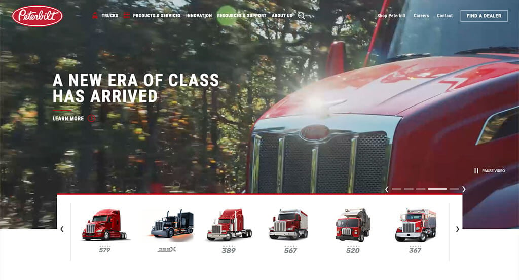
Peterbilt is a commercial truck manufacturer offering highway, vocational, medium-duty, and electric trucks to companies around the globe. If you think their trucks look tough, you should check out their website! As you scroll through the site, you’ll see the same red & white color combo from their logo, with black interlaced throughout the design.
An interesting feature of this website is it allows you to pause the video on the banner, which should become a universal feature as it would help those who have slow internet connections, low performance computers, or accessibility concerns.
Another highlight of the website is the social media & latest news sections, both of which display recent social posts and news headlines related to Peterbilt. These two sections help drive consumer engagement by displaying the trucks in unique situations the product pages otherwise couldn’t do.
This is truly a great site and worthy of inclusion in our best web design article!
Ranked in our Best Industrial Websites Article
15. Embassy Dental
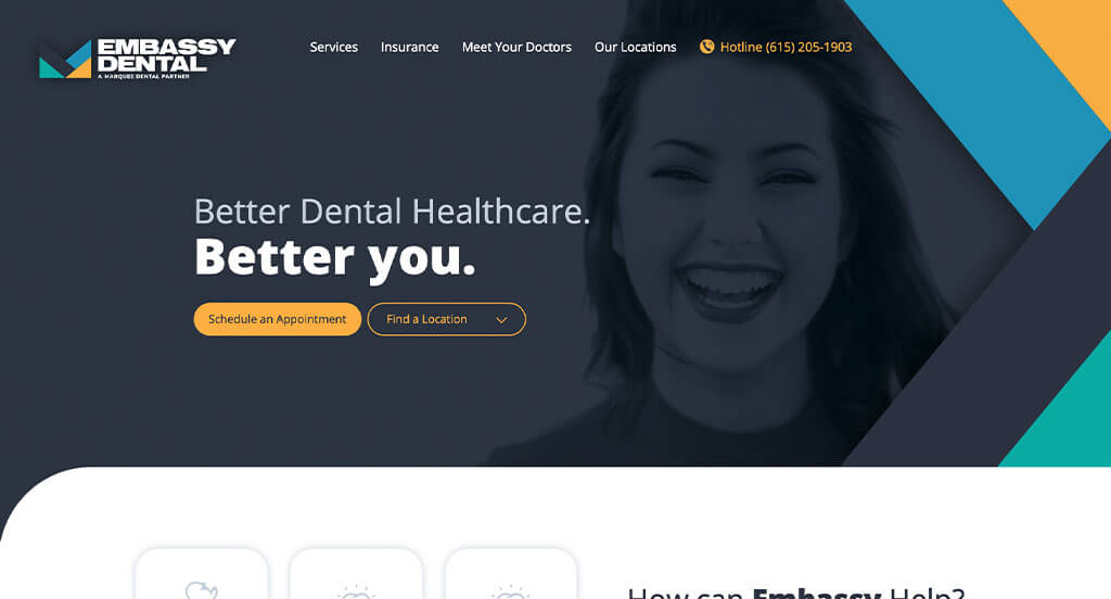
Making use of vivid and bold colors, the contemporary design of the Embassy Dental website manages to set itself apart from its peers. It impressively couples an exciting background image with a gray overlay, high contrast colors, and graphics that come out from the side to draw visitors’ attention. The colors used to make this incredible contrasting effect include marigold, blue, teal, navy, and white.
Apart from the great colors, rounded corners are applied to nearly every aspect of the site to contribute to the overall modern design. Rounded corners assist in information digestion, making it easier for the viewer to navigate to the next part of the page.
We also have to give credit to the web designers of Embassy Dental’s website for the typography that they used. The added weight & spacing to the font continues the modern trend this site has going.
All of this combined makes the Embassy Dental’s website one of the most sleek and modern websites we have on our list of best website designs. Make sure to look at their website for inspiration!
Ranked in our Best Dental Websites Article
16. Crows Nest Barbershop
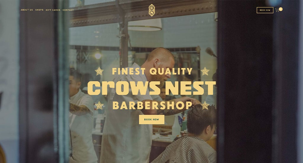
The Crows Nest is a barbershop chain with locations throughout various cities in Canada. Their website breaks the norm of what you might see on other hair stylist websites, which helped ranked it as a best website design. The site has a mysterious aura that emanates from its use of dark shades of green, yellow, blue, and pink, making people want to spend more time browsing around.
The use of unique location photography gives the site an added urban & local feel, with each photograph being overlayed with a different color. In addition to the fun street photography, the Crows Nest offers a video showing the crew’s tastes and interests. All of this adds to the authentic allure that you’ll get when you go to the Crows Nest Barbershop.
Ranked in our Best Hair Salon Websites Article
17. Sonoco
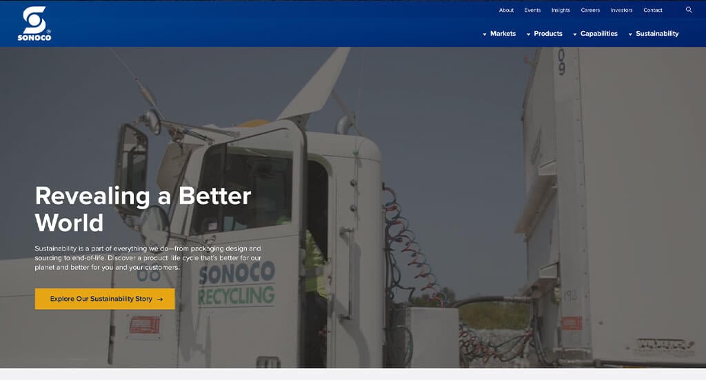
If you’ve made it this far in our best website design blog article, you may have noticed we tend to enjoy websites that have videos in the above-the-fold section. Sonoco’s website is no exception. The video follows the entire lifecycle of their product, which begins with the backstory of their environmentally conscious culture.
Throughout their site, they use combinations of dark blue, light blue, white, and yellow to direct their visitors’ attention to call to actions. They also use expertly crafted sections throughout their homepage that highlight different strengths the company is known for in the industry.
The navigation and sticky header follow a trend with other websites that we’ve been impressed with, too. If you’re looking to build a large manufacturing website, make sure you check this one out!
Ranked in our Best Manufacturing Websites Article
18. Nelson Global
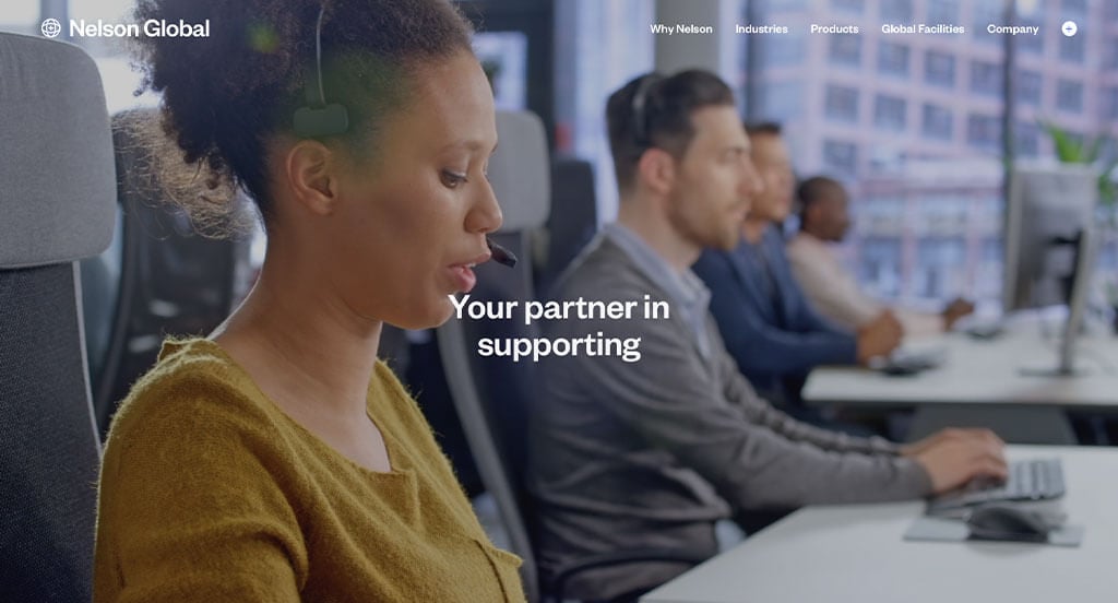
Nelson Global is a leading global provider of highly engineered energy, industrial, and transportation solutions. They have separate sections for each industry, from construction to military and railway to agriculture. We like the website Nelson Global for a variety of reasons, making it an easy inclusion in our best designed websites article.
The first reason we enjoy their site so much is the video above the fold. Not only is it interesting, but it also has words that rotate through it. This gives the frames of the video more emotion and power.
Another reason we appreciate this website is due to its modern typography, interesting use of photography, and tasteful use of graphics. They also utilize a fun cursor trail that morphs into different shapes and will say something if you hover your cursor over a button or unique section.
Overall, this best website design example has a clean, minimal, and modern design with a color scheme to match.
Ranked in our Best Tech/IT Websites Article
19. Gulfstream
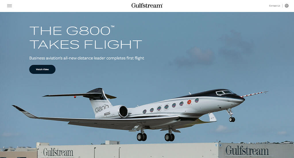
Up next is Gulfstream’s website, which also ranks as a best website design.
We feel like the web designers of the Gulfstream website used negative space ingeniously on this website to accentuate important content sections. Their abundant use of negative space could perhaps be a crafty and intentional decision in conjunction with their unique use of typography.
Speaking of typography, they utilize smooth curves and long lines like that of the wings of an airplane. With the typography in the middle of the negative space, we couldn’t help but think the typography loosely resembles an airplane flying in the middle of the sky. All they needed to add was a couple of clouds and a sunset to complete the vision!
Beyond that interesting observation, we also enjoy their use of creative photography, colors, and videography throughout the site.
Ranked in our Best B2B Websites Article
20. Good Start Packaging
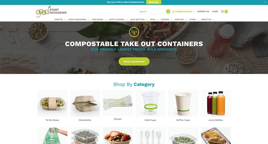
Good Start Packaging comes out of the gate strong with great use of negative space and a bright & fun, green & blue color combo.
This color combo can be seen everywhere in their website header, including their logo. Even the footer and CTAs are engulfed in either bright & earthy yellow/green or the bright & fresh blue that resonates with eco-friendly.
Good Start Packaging utilizes space well throughout its homepage. The “Shop by Category” section near the top has great imagery, ensuring the visitor can quickly identify where to go to get exactly what they need. We also appreciate the “Featured Brands” and video section further down on the page.
Overall, the Good Start Packaging website does a great job at offering visitors a fantastic user experience if they’re in the market to source eco-friendly packaging in bulk. We are happy to include this as a best website design idea for others to consider.
Ranked in our Best B2B Websites Article
21. Runners Fix
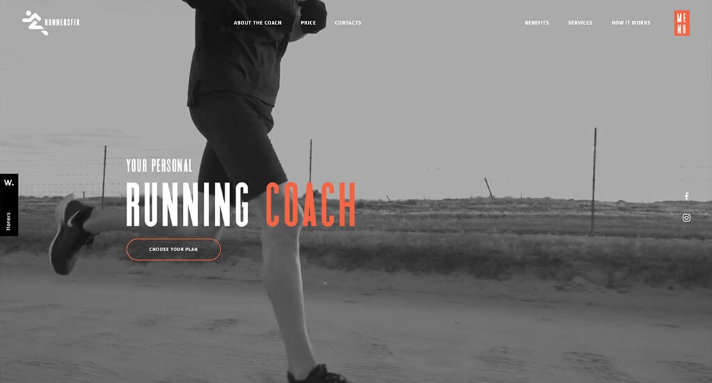
Runners Fix offers personal training to those who are interested in bringing their running game up a notch. If their athletic coaching is anything like their website, you’re in for a real treat!
This website has a modern look that is streamlined into just a few pages. It has an industrialized look, as its main three colors include a heavy amount of grey, with white and orange cream accents. Orange is an excellent color to use when creating athletic websites as it represents positivity, motivation, and enthusiasm.
We genuinely appreciate the layout of the vital information that someone looking to join might need to see. For instance, as you scroll past the awesome hero video, you are immediately greeted with a section describing the main coach’s history and accomplishments. This is followed closely by a benefits section, then free tips, and finally the pricing plans.
The website continues with more important sections, but the idea is nothing is hidden, and everything is right at your fingertips. If you’re looking to build the best website possible for your personal training business, make sure to keep this site’s strengths in mind when discussing options with your web developer!
Ranked in our Best Sports Websites Article
22. NOBULL
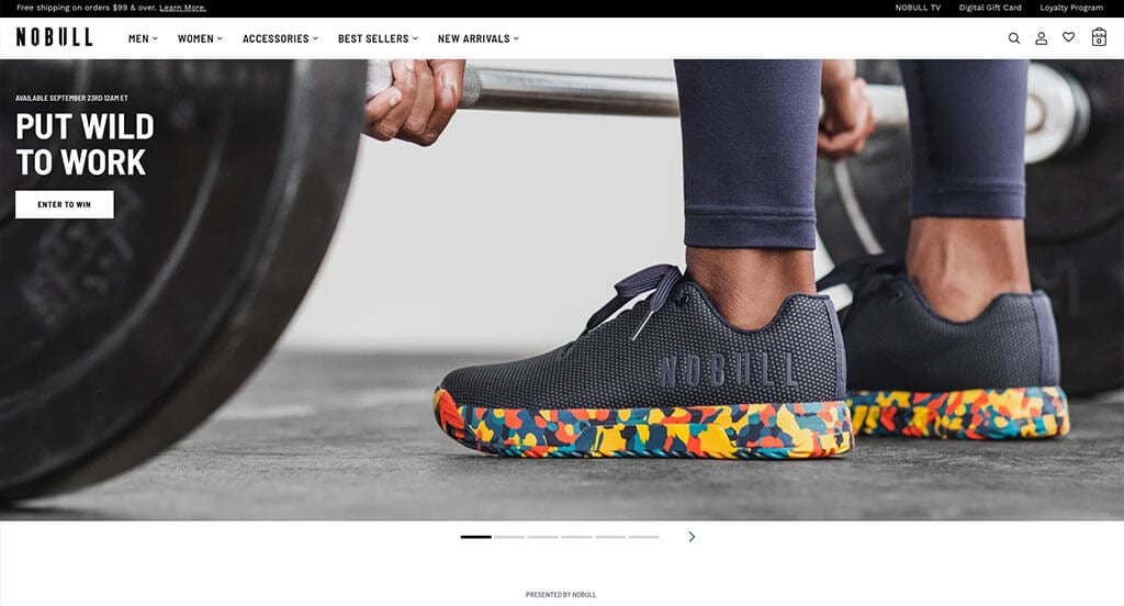
NOBULL is a fitness clothing company that specializes in creating gear for those looking to maximize their performance during cross-training activities.
NOBULL’s website isn’t as avant-garde as some of the other sites on this list, but that would seem to be exactly on brand from them (not to say that their products aren’t advanced, just that their site contains NOBULL). The site is checking off all our boxes though, and we enjoy their straightforward navigation system that is sticky when you scroll past the top section. They even got an Honorable Mention from Awwards.com!
Beyond the above-the-fold section, you immediately get access to all the catalogs someone would need (men’s, women’s, bags & accessories, etc.). Past their products section, they shine a spotlight on their vast community of clubs and organizations they sponsor.
If you’re in the market for creating a fitness website, be sure to check out NOBULL’s website. We’re sure you’ll enjoy your experience on their best website design!
Ranked in our Best Sports Websites Article
23. LARQ
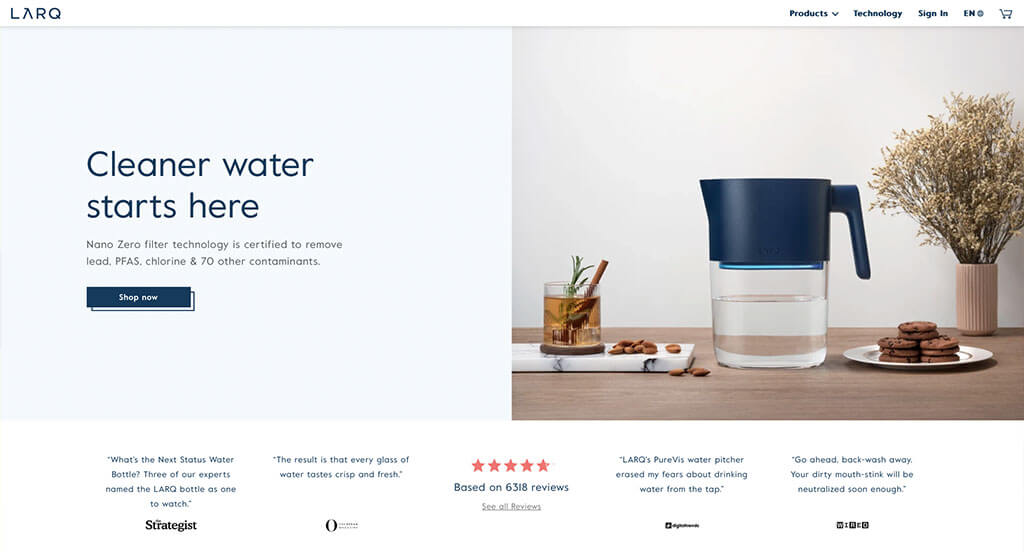
This website is unique because it uses a lot of white space and has a minimalistic design. The color selection is also minimal, which gives the website a clean and modern look. The white background, and shades of blue, give an overall fresh and minimal look.
The website is also easy to navigate, and the products are well-organized. The color combinations of the website are very refreshing, especially with all the black-and-white photos on each page. It’s hard not to get inspired when visiting this best website design example.
Coupled with their captivating branding and delightful logo, we’re left in awe of the attention given to the detail on LARQ’s website! Overall, this is a great website example of a modern and minimalist design.
Ranked in our Best BigCommerce Websites Article
24. Kettle & Fire
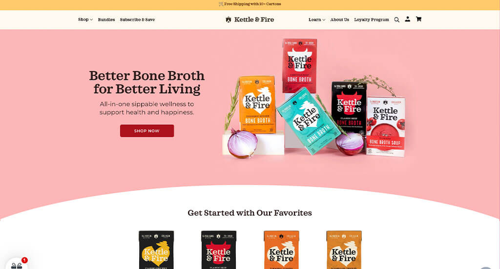
Kettle & Fire specializes in providing their customers a variety of animal bone broths used to make soup and other recipes.
We enjoy the repeated use of curves throughout their website, which allows visitors to transition more easily to the next section without unconsciously getting stuck on straight or jagged lines.
Another web design aspect we enjoy from their site is the uniqueness of each content section. From the above-the-fold section to the “Find Us in Stores” section, not one area repeats itself in design.
Ranked in our Best Ecommerce Websites Article
25. Magic Spoon
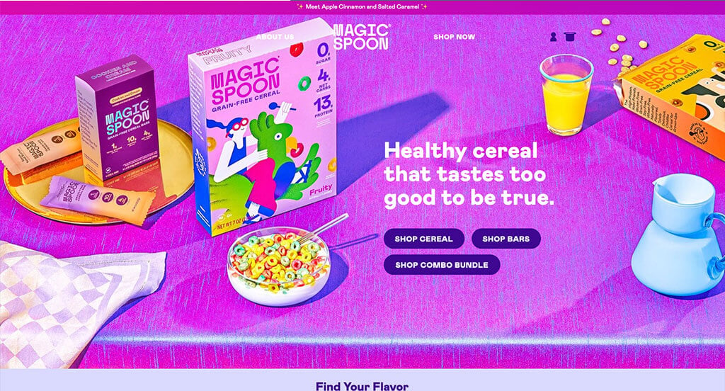
Magic Spoon allows you to eat fun-colored and great-tasting cereal, but with zero sugar! Truly a win-win for children and adults everywhere.
It’s a small website with only a handful of pages, but like their cereal, each page is full of the good stuff and none of the bad!
Their website is also just as bright and fun as their cereal. You’re greeted with a hot pink, above-the-fold section with some cute slogans about their cereal. There are also contrasting buttons that will bring you right to where you want to go.
One unique thing about their homepage is they overlay parallax graphics on top of the sections. The result is a bunch of cereal pieces spinning on top of the sections as you scroll through the web page, adding infinite amounts of fun with each push of your scroll wheel!
Overall, this best web design example has a trendy, modern, and flamboyant vibe to it that is seldom seen but greatly appreciated. They’re “Happiness 100% Guaranteed” statement does not disappoint as we view their website.
Ranked in our Best Ecommerce Websites Article
26. Winc
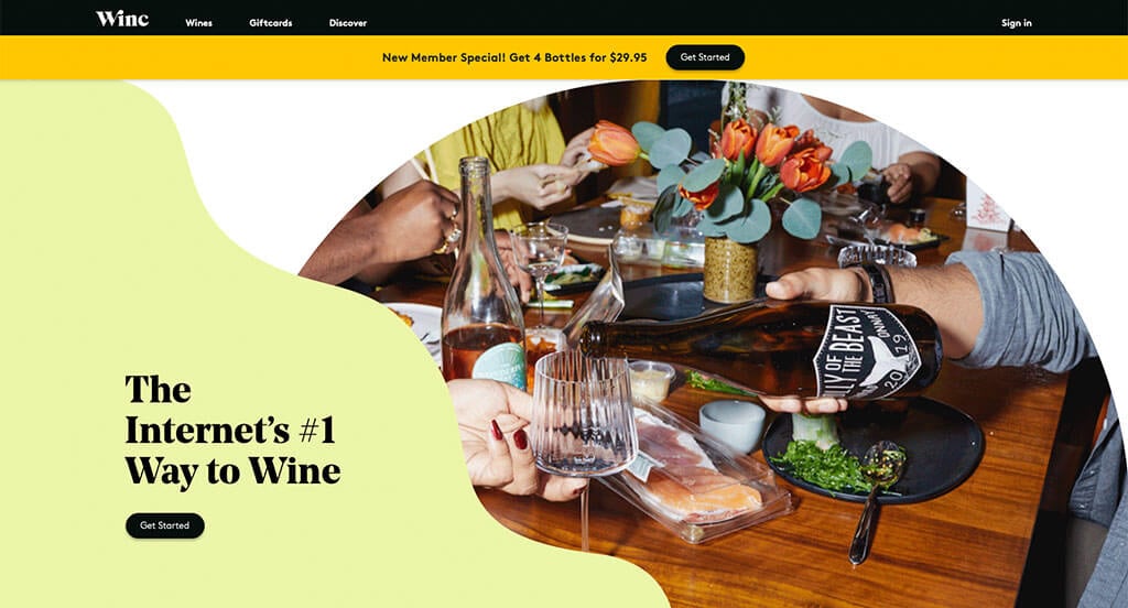
Winc offers subscription plans to people who want to receive four unique bottles of wine from around the world each month. Their homepage is fun and colorful, with a variety of pastel shades throughout the web design.
One creative element they use throughout their homepage is that they combine graphics of wine spills with imagery of fresh ingredients. This extra level of style lets them rise above the competition by making the viewing experience memorable.
If you’re looking to create a top-notch website for your subscription business, you might want to check out Winc’s site to learn what makes them so successful.
Ranked in our Best Ecommerce Websites Article
27. Acumen
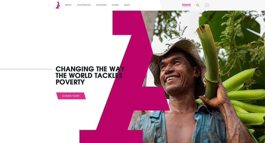
Acumen is an organization driven to end the earth’s poverty situation with the slogan “changing the way the world tackles poverty.” Through their efforts, they claim to have transformed the lives of more than 309 million people!
They offer a unique approach to their website’s design, speaking more through images than words. This leaves a powerful impression when viewing their site.
Even though Acumen is determined to save the planet, they didn’t forget key aspects of conversion rate optimization. At the right-hand corner of the sticky header, they have a donate button to allow potential donors to gift any sum of money quickly and easily.
Also, the website is extremely user-friendly thanks to the header that contains all the sections their potential donors might be interested in browsing. Investments, academy, funds, and reports – everything is available on the homepage, and the clear structure makes it easy to navigate.
Ranked in our Best Non-Profit Websites Article
28. Planet Fitness
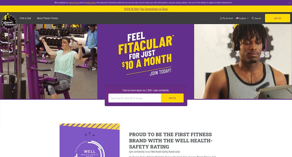
Planet Fitness is a successful chain of fitness gyms that strive to appeal of the everyday person. Even their website welcomes you in with a lively and vibrant digital marketing strategy.
The homepage begins with a three-column layout that features two videos of happy people exercising. Right in between those people is a “Join Us” CTA for quick conversions.
The homepage breaks into sections describing what they do, the perks that come with their gym membership, how they help the local community, and more. Each of these sections are broken up evenly with negative space.
One feature they excel in is their “Find a Club” page. They innovatively use this section by displaying a map on the right side of your screen and a search & results section on the left side of your screen. Most fitness centers use a similar method to display to their customers every location they have, but the way Planet Fitness implements it is by far one of the most simple and easy to use, making this a contender for a best website design.
Ranked in our Best Fitness Websites Article
29. .strandberg
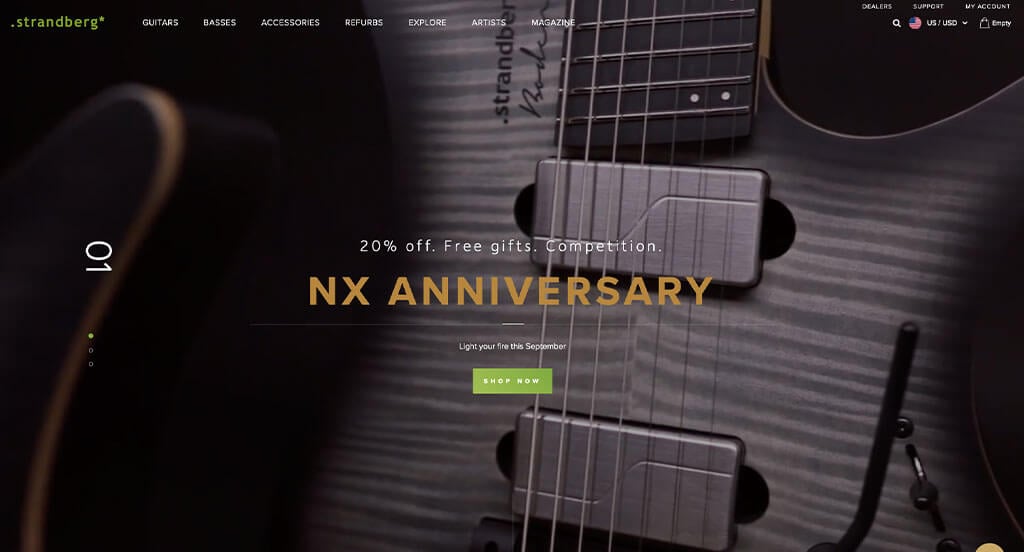
Strandberg is a guitar manufacturing company that utilizes a combination of CNC machining and handcrafted parts to design beautiful instruments. Their website is clean and modern, utilizing advanced features to display their “minimalistic and otherworldly” guitars.
Their homepage experience begins with a beautifully constructed video displaying several of their guitars, as well as people actively jamming out with their guitars in hand. Strandberg utilizes a unique black and lime-green color scheme that pairs elegantly with the white text and white separators. Ultimately, this combination creates a rare aesthetic that is both sleek and minimalistic.
We really like the design of the individual product pages, which feature prominent photos of the guitars with clear descriptions of the specs and features. Another nice touch is the inclusion of customer testimonials on each page. As you scroll down the homepage, you’ll find social media links for Facebook, Twitter, and YouTube. There are also options contact them via email or phone. Artistic videos of guitar playing are also at the bottom of the homepage.
Make sure to check out their website if you want inspiration on creating a highly unique site for custom products. If you strive for a great website, you might make it into this list of best website designs, too!
Ranked in our Best WooCommerce Websites Article
30. JOCO Cups
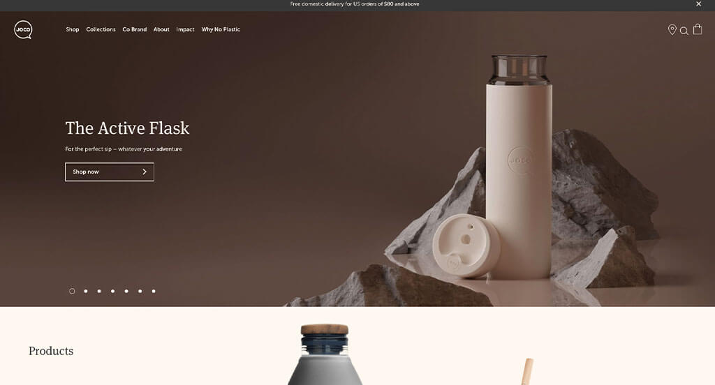
JOCO designs reusable, 100% plastic-free cups that are created with silicone and borosilicate glass. Their website reflects their product by maintaining an image that is simple and easy to use while also implementing soft earth tones.
The JOCO website utilizes soft pinks and warm browns to create a calming effect for its visitors. It is also easy to navigate and has a user-friendly experience featuring a sticky header that follows the visitor while scrolling.
One thing we must note about their site is that they have excellent product photography on all their pages. This is one area that will set apart great websites from average websites, helping you get ranked as a “best website.”
If you’re interested in creating an amazing website that has warmth and a calming effect, check out JOCO’s website to experience the sensation!
Ranked in our Best WooCommerce Websites Article
31. The Ridge
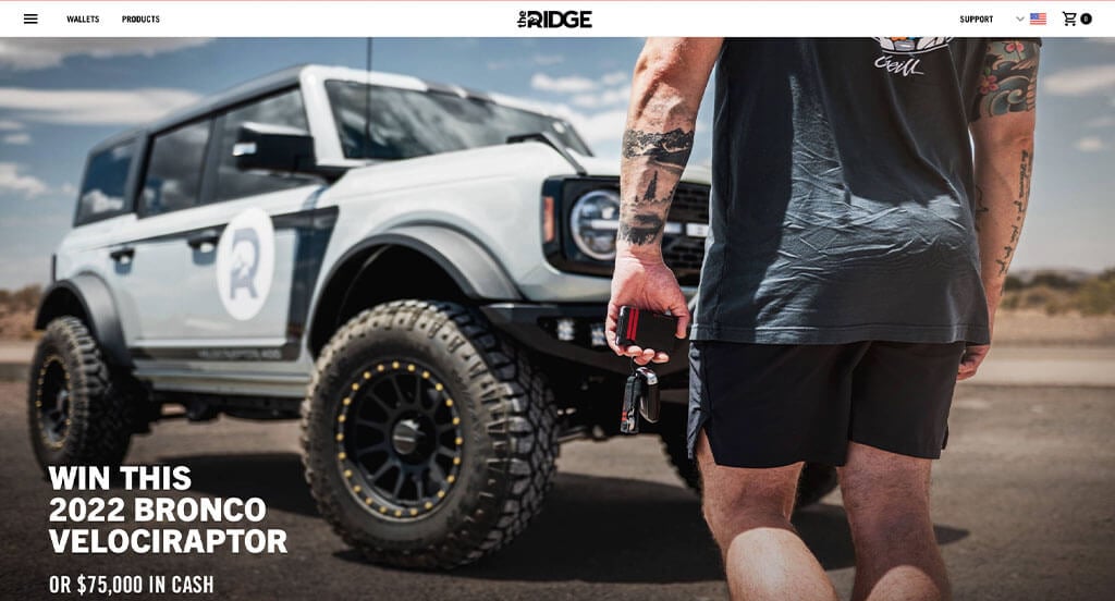
The Ridge designs and sells minimalist & rugged everyday carry items, such as wallets, knives, key cases, and more. Their website embodies the same minimalism and ruggedness their products exhibit. This is immediately evident when loading their fast website.
The Ridge’s homepage begins with a huge hero section that contains a clear image of their featured product with a clean-cut blurb and call-to-action. Without missing a beat, the website shows you a variety of best-selling items and new colors before finally showcasing the ability to personalize your desired products.
One thing The Ridge does exceptionally well is they emphasize their products using large, clear images. They maximize the effectiveness of their imagery by reducing negative space to a minimal amount. Too much, or not enough, negative space can reduce focus on your website’s content and may ultimately confuse your visitor. A great website design example shouldn’t confuse a visitor since that will lead to high bounce rates.
Overall, the website is well-designed, has modern characteristics, and simple navigation making the whole experience feel professional and polished. If you’re looking to create a website that meets these qualifications, check out The Ridge to learn from one of the best!
Ranked in our Best Shopify Websites Article
32. Black Diamond
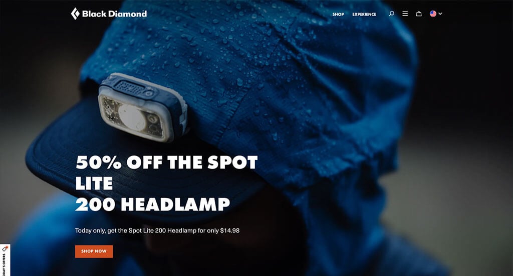
Black Diamond makes some of the most rugged and dependable climbing, hiking, and outdoor athletic gear on the market. Their website excels at utilizing full-width imagery to display action photos of people using their products. This helps generate excitement for the visitor!
One interesting aspect of this best website design example we don’t often see is the use of an extra-large, unique footer section. Black Diamond seamlessly integrates their social media section into the footer by using a black background. The footer is then separated into multiple sections using a single line that creates the appearance of a mountain rising over flat ground.
Beyond the footer, their black and white color scheme creates a sporty theme which makes the website stand out from the competition. The color scheme also allows the colorful products to take center stage without detracting from the design. This creates a very appealing look for Black Diamond’s award-winning website.
Overall, Black Diamond’s website is one of the best BigCommerce website designs we’ve found. It is aesthetically pleasing and user-friendly. This website design is a treat to use for adrenaline junkies and website enthusiasts alike!
Ranked in our Best BigCommerce Websites Article
33. Marucci
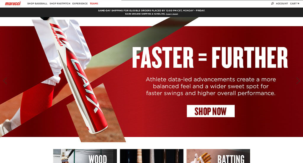
Marucci produces high-end, fully customizable baseball bats tailored to an individual’s specific needs and tastes. Marucci does a great job of using clear imagery and video on its homepage to showcase its products.
Their red, white, and black color scheme is eye-catching, but doesn’t distract from amazing product photography.
Something that really caught our eye about this website is its baseball & fastpitch bat customization page. You’re able to customize nearly every detail of the baseball bat and see the product image update in real-time. This allows you to see exactly what you’re going to receive when your baseball bat is delivered to your home. No curveballs in this ordering process!
We must congratulate the web developers of this website for making the navigation so simple. Especially considering how many different product categories are featured on the website. To maintain a slimmed-down, minimalist sticky header they reduced the main menu options to “Shop Baseball”, “Shop Fastpitch”, “Experience”, and “Teams”. Within each of those sections, they then expand into the huge variety of product categories offered.
Overall, Marucci’s website design offers a clean and streamlined experience for baseball and fastpitch players alike. It’s easy to find exactly what you need, and if you want to customize your bat, their product configurator is simple and fun to use. If you’re looking to build a website for your custom athletic gear, make sure you look at Marucci’s website for inspiration!
Ranked in our Best BigCommerce Websites Article
34. Insurify
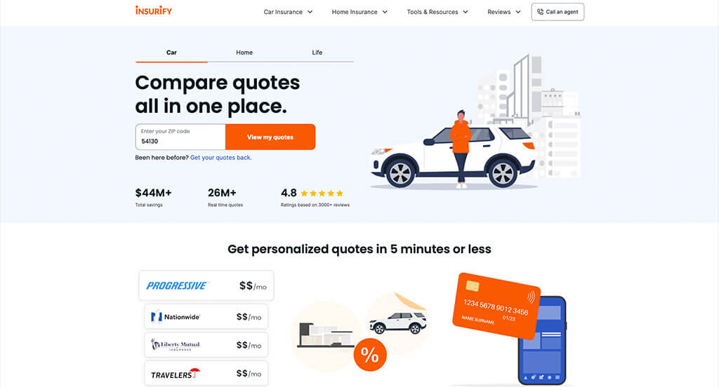
Insurify is a service that will help you compare car, home, or life insurance prices from a variety of insurance companies. This helps you avoid the hassle of calling each of them separately. Their homepage design structure flows nicely while also effectively utilizing a white, blue, and orange color scheme.
Insurify’s web design layout flows well and features a lead form to receive a quote for insurance. Reviews are also visible at the top of the layout, with more detailed reviews soon to follow if you scroll. This gives visitors a lot of confidence in the Insurify brand.
In short, Insurify’s website is what you would expect from a modern SAAS website. It’s blue and orange color scheme gives the website a quick, punchy feeling that is hard to beat!
Ranked in our Best Insurance Websites Article
35. The Cool Club
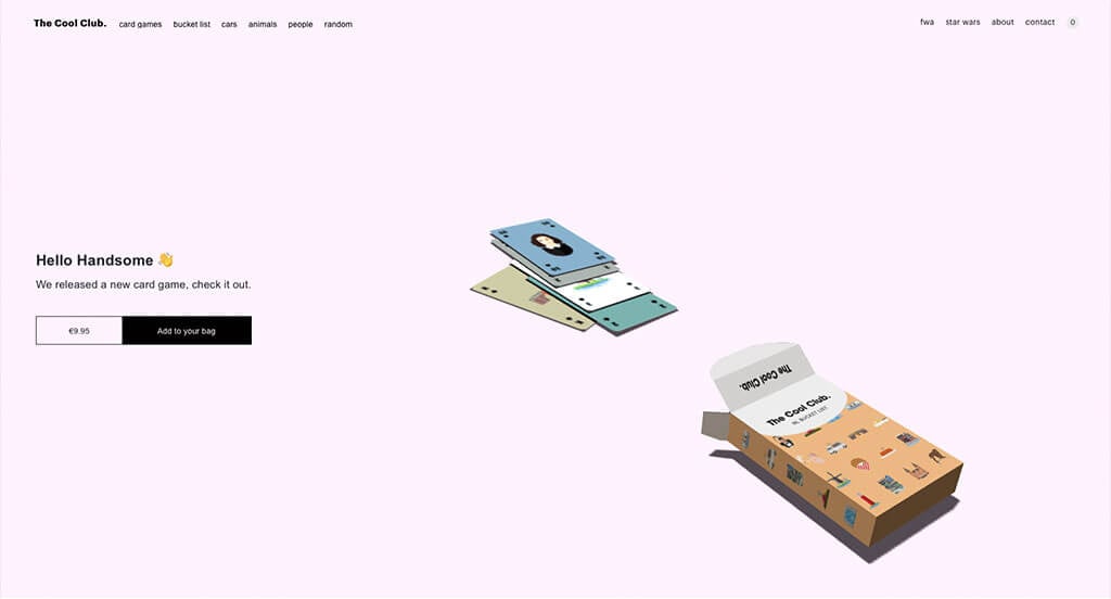
The Cool Club designs and sells unique playing cards. The uniqueness doesn’t stop at their cards though! Their website is something to behold and has a feature you may not have seen before.
After loading their homepage, you’re greeted with a box of cards that begin spitting out the playing cards hidden inside. As you move your mouse around the page, you’ll quickly notice that the box begins to move. However, if you go ahead and click on the box, a card will jump out and land near the other cards that have already shot out! It’s a cool party trick, something a bit more avant-garde than what a more traditional ecommerce website might have, but it’s fun nevertheless!
Scrolling past that fun, interactive feature you will come across some of the different styles of playing cards and posters they offer. The Cool Club relies heavily on negative space on this website, but all that negative space highlights the products!
The Cool Club’s website is aesthetically pleasing and quite possibly one of the least cluttered websites on our list (except when you make a mess with the playing cards of course!). We also recommend checking out the collections they have in the top/right menu bar, as those offer something fun to look at as well!
If you’re interested in having a cool website like this, you’re going to need to hire an expert web developer. Make sure you talk with your web designers to see if they are capable of something like this before embarking on the project!
Ranked in our Best WordPress Websites Article
36. AllBirds
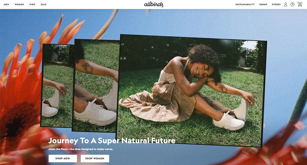
The AllBirds website is a great example of a “best designed” website. Their site is fast to load, features fresh photography, uses great call to actions, and has a pleasing color scheme.
Quite possibly our favorite feature is the shopping experience as it begins on a category page. The rollover effects on collection pages that show different shoe sizes is a great touch. When you get to a product page, the layout with the two-column grid of product images is very pleasing. We particularly appreciate the lifestyle photos to show the shoes on a person. As you scroll on the product pages you’ll get to learn about the product’s sustainability and manufacturing, which is great for learning about the product.
Go ahead and check this website out to see for yourself why we ranked it as a best website design.
Ranked in our Best Ecommerce Websites Article
37. Secrid
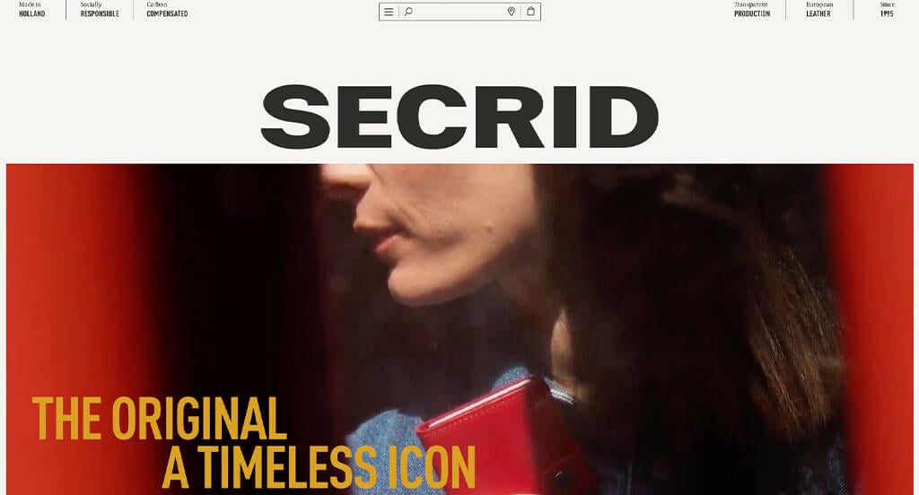
This is a cool website when you first open it up. All the design elements animate into view, which is a unique touch. The logo is oddly under the search bar, which is a different layout concept than we are accustomed to seeing. You can’t fault someone for being creative though!
As you scroll through the site, you’ll find there is a lot of white space filled in with large product images. The stick header is interesting, since it is just a minimal, mobile-inspired sticky header. All the content on the homepage continues to animate into view, which helps you follow a story-line approach to the unveiling of the content.
Their store finder has a unique design as well, featuring a theme colored Mapbox integration. The site is also powered by Next.js, which is a more technologically advanced JS framework. This is a great website to have included in a list of the best web designs.
First time ranking in our list!
38. Tillamook
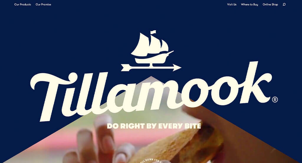
The Tillamook website starts with a loading graphic, which features the ship icon of their logo coming into view. From there, it takes a creative slice out of the blue background to show you a video and encourage you to scroll down to learn more. As you begin to scroll, the logo quickly attaches to the top of the window, immersing you in a full-screen video. This is a great start to a high-quality website design.
As you scroll through the homepage you begin to get an understanding of their company, culture, and products. The photography is all on-point, leaving you with the feeling of a professional website. They even have theme colored popup boxes for things like newsletter signups, rather than just leaving a default color scheme. Everything on this website has been thought through, which is evident.
Even the footer has a minimal, yet appealing design to it. This played a factor in our decision to include it as a best website design entry in this blog article.
First time ranking in our list!
39. Zwift
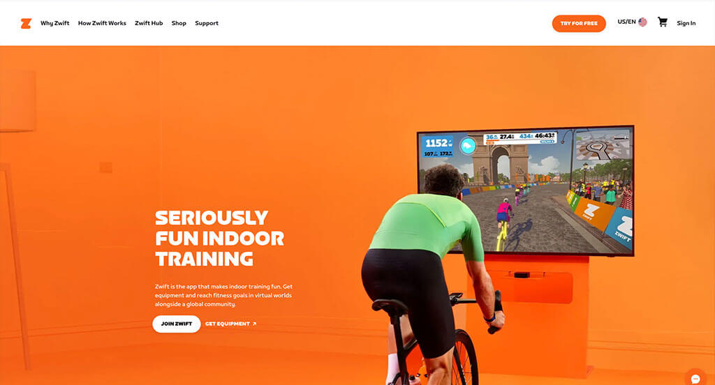
The Zwift website starts you out with a very colorful animated video of the product and platform. They are a smart fitness company, which you’ll come to realize after you start scrolling on the homepage. You’ll come across sections talking about features of their platform, links to the product pages, financing options, and even a free demo.
The color scheme uses a lot of bright blues and pinks, but it works well together and fits the theme of their platform. It energizes you while navigating throughout the website.
When you get to the shopping area, you’ll find a well-organized category structure with nice rollover product images. They even took the time to get lifestyle photos on most of their product pages, which is a helpful shopping feature.
First time ranking in our list!
40. Rad Power Bikes
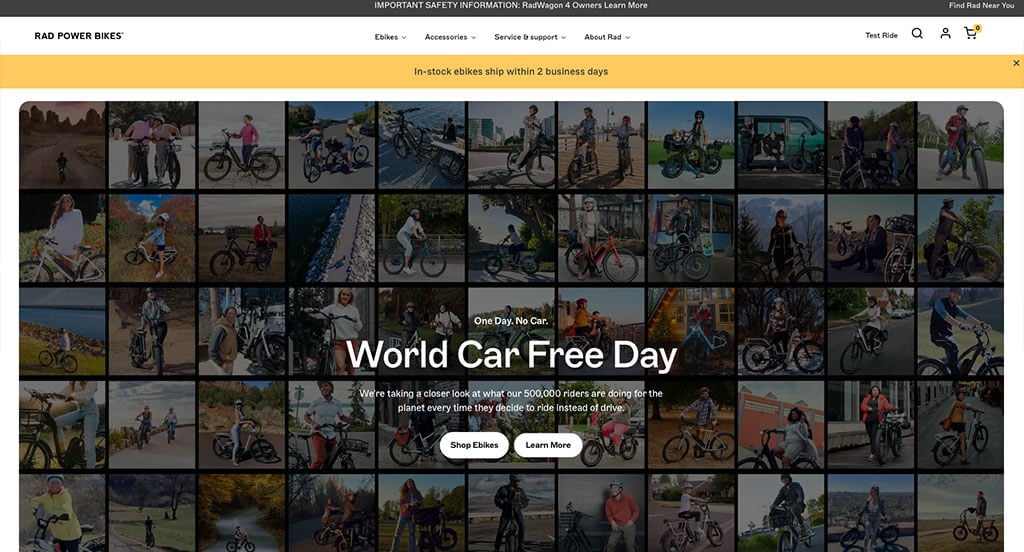
The Rad Power Bikes website is a great example of an electric bike website. They have pleasing colors that don’t distract from the products, with a gray color scheme used that matches the Rad Rover 6 bike.
You can tell within the navigation dropdowns they put a lot of thought into the organization of their menu. It was a great touch adding a small picture of each bike model into the Ebikes dropdown, since that helps you get a better understanding of that category before clicking it.
The category pages use some of the largest product images we’ve seen on an ecommerce website. This makes sense though considering how important the bike’s overall appearance is during the shopping experience. The product pages are also a masterpiece, full of helpful content to describe the bike’s feature, appearance, and specifications.
If you’ve got a large budget for a premium website design, check this website out for inspiration.
Ranked in our Best Business Websites Article
41. Irvins
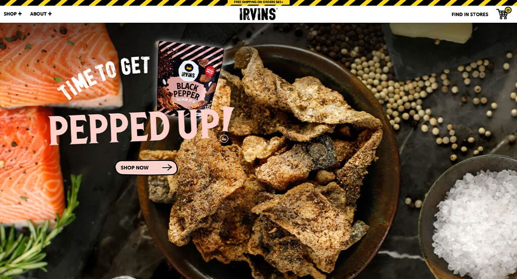
This is a fun and exciting website that gets you in the mood for snacky foods. They have a great color scheme and design style picked out for their brand. Everything you see on the website for graphics, photography, and other multimedia is well thought out and keeps to their branding guidelines.
The shopping section, particularly the category pages, takes the extra step toward creativity. You’ll notice there is a unique potato-like background graphic behind each product, giving an extra fun appearance to the page. Even the product pages have a special layout with great typography and call to action buttons.
It isn’t hard to be impressed by this awesome website example. Be sure to check it out if you are going for a fun, creative look for your next website design.
First time ranking in our list!
42. Aro
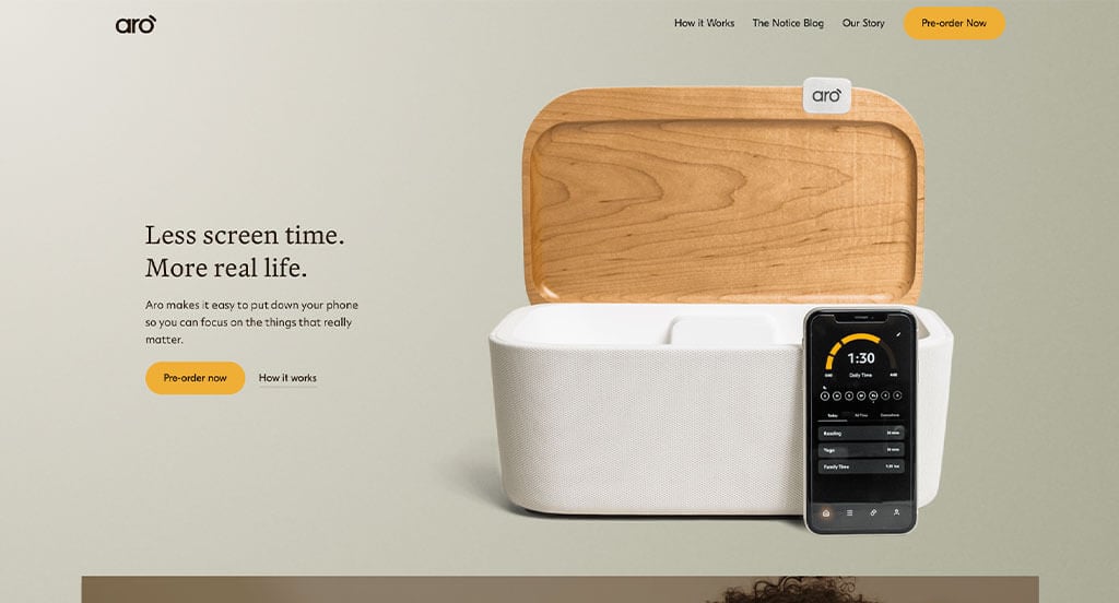
This is a very pleasing website design. The Aro organization promotes family values and togetherness. The design style and color scheme emphasize a modern, clean, and soothing feeling with its soft colors and clean fonts.
We love that they focus on promoting their product right away, but then immediately go into trust signals like third-party sponsorships, relevant statistics, demonstration videos, and testimonials. You can tell their web design team put a great deal of emphasis on the product story when laying out this website.
The blog layout was also a uniquely designed feature we’d like to highlight. They took the time to design this area to be equally appealing and comforting. Go ahead and check this one out if you are looking for a soothing website design example.
First time ranking in our list!
43. HydraCup
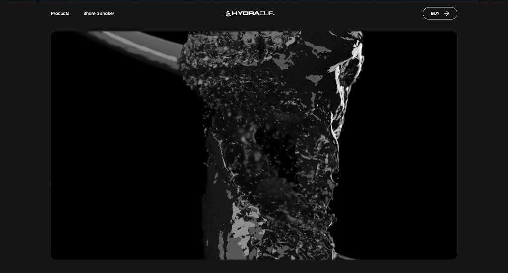
This is a great example of a dark color scheme website. When you first load the page, you don’t see a non-monochromatic color until the product comes into focus in the video animation. This trend continues as you scroll – only the product areas have color.
As you get deeper into the website, more color splashes into other areas of the site. You’ll be drawn to important areas though by their creative use of color on the website.
The social media integration was nice. They use TikTok and Instagram widgets to show lifestyle photos of the user-generated content variety. This is a website worthy of a look if you have time.
Ranked in our Best Sports Websites Article
44. Perfy
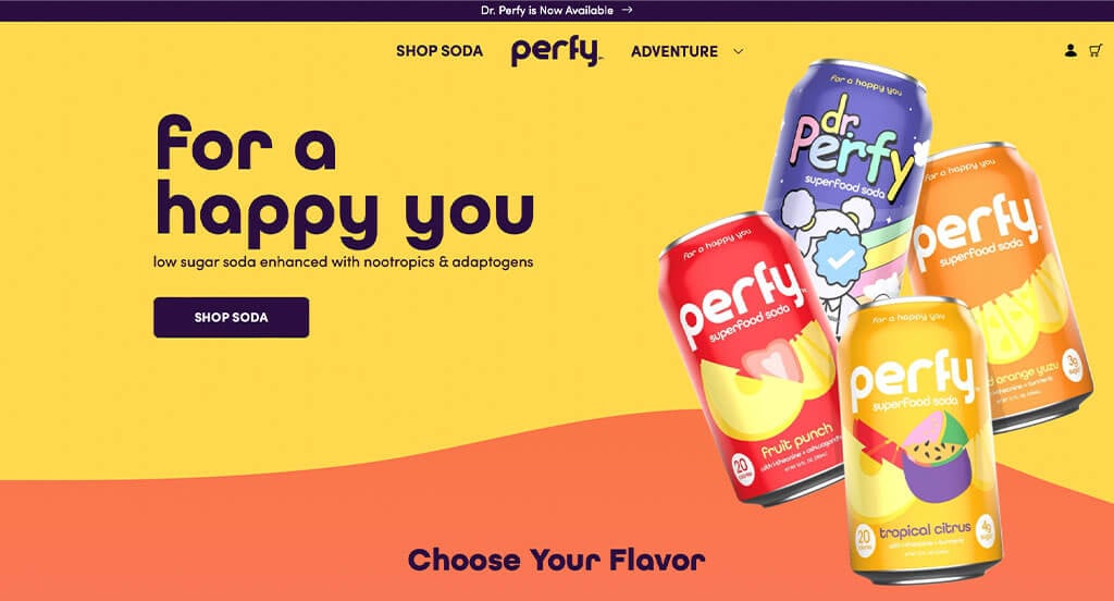
This is yet another fun website design example. I’m not sure why we include so many of these more energetic website designs. Maybe it is because so much of the internet focuses on clean-cut, professional websites that use right angles and straight lines.
As you scroll through this best website design example, you’ll find all kinds of interesting design features. We particularly liked the creative icons, smooth fonts, box shadows, and curvy/twisty lines everywhere. If you scroll all the way to the bottom, you’ll even find a cool bubbly animation behind their review section.
This is just a fun, entertaining website to look at. We’d suggest reviewing it if you are looking for something outside the box.
First time ranking in our list!
45. Slate
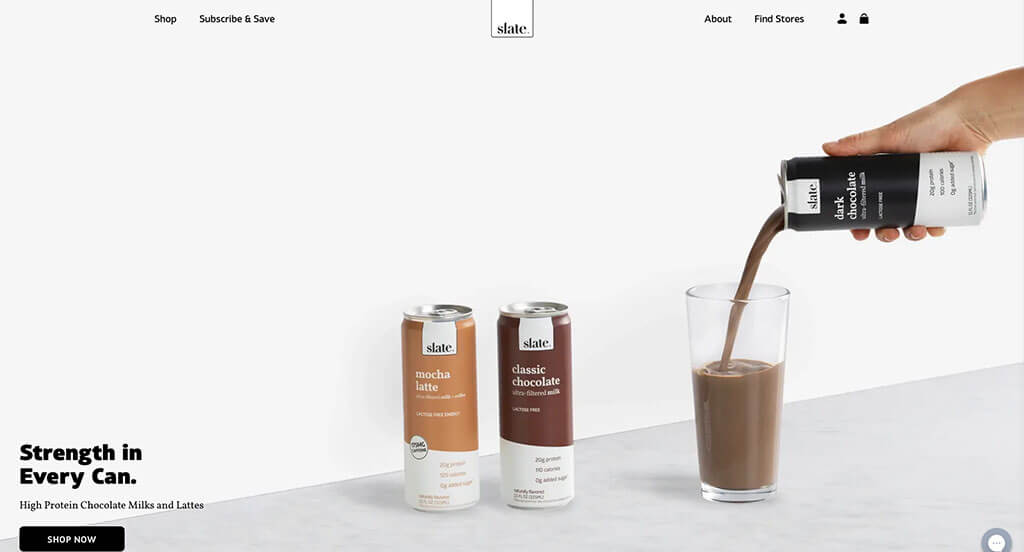
Another incredibly modern, minimal website design example. This website made it into the best website designs article because of how clean and professional the design of the site was. They did a great job of introducing color through their products.
If you think about it, the design style they chose was possibly the only one that would really work to make their product really pop off the screen. When you’ve got a beverage that uses dark colors like tan, brown, and black, you need a way to pull this into the forefront which is easy to do with a minimal design that uses a lot of white space.
As you scroll through the homepage, you’ll find lighter colored products in their Vanilla and French Vanilla flavors. Here they chose a subtle light blue background to help liven up the lifestyle photo of the product. Everything is very crisp with this website, even how they integrate reviews and social proof.
First time ranking in our list!
46. Vibrants
This is a great web design example that uses a soft, pleasing color scheme. As you scroll through the website, you won’t ever encounter a bold color. You’ll find easy to read typography though, which is the center of your attention. To liven things up, they used animations of people holding their products.
Their product pages use Okendo for collecting and displaying customer reviews. This is a nice integration for user-generated content on product pages. It makes for streamlined review collection, which includes options for user photos to be added.
An overall great web design example to review when developing your next website.
First time ranking in our list!
47. Krave
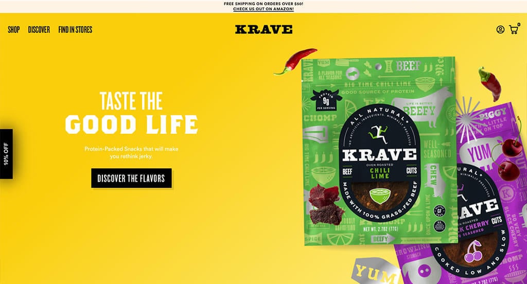
Another fun website in terms of colors and photography, but with straight lines (instead of waves, swooshes, swirls, etc.) in the content layouts. They include all kinds of exciting features on the website, like chili peppers and cherries floating around their product’s packaging. This helps show people the flavors of their jerky treats without having to read.
The design of their product packaging is top-notch. As you scroll on the homepage, you’ll find pictures of their packaging for various flavors. They use a different color to separate out each flavor, which is dominant on each product’s package.
The product page layout is also well thought out. It includes icons to describe the qualities of the food item, different pack sizes to choose from, and an unobtrusive subscription option.
You’ll want to check this out if you are searching for attractive, exciting websites full of color that don’t include cartoony shapes and swooshes.
First time ranking in our list!
48. Windmill Air
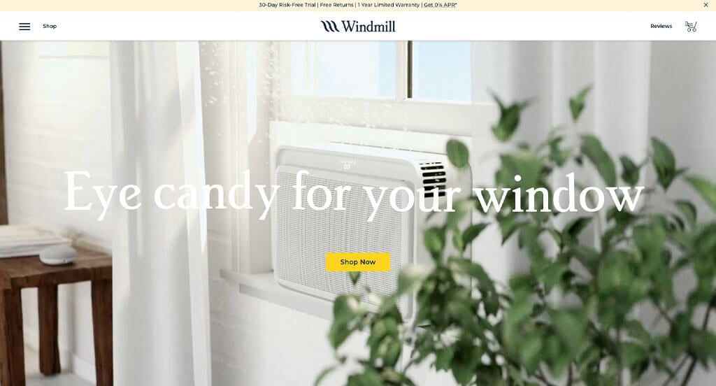
This modern and clean website starts you out with a large video hero banner. The video does a great job showing you the product. Once you start scrolling on the page you’ll encounter animated social proof outputs, then an introductory video, then detailed product features. They use a good mixture of photography and illustrations to showcase their company and product.
The color scheme is very clean, which allows you to consume their content without getting distracted. We particularly liked the animations on the menu drawer as you hover over each item. The product pages also have a pleasing design that gets right to the point of features, but also offers the option to customize the product. These pages also show the story of the company and product as you scroll down to learn more about the item you are considering purchasing.
This is a solid contender for consideration as one of the best websites online. You really can’t make many improvements to such a well thought out design and content strategy for a website.
First time ranking in our list!
49. Jot
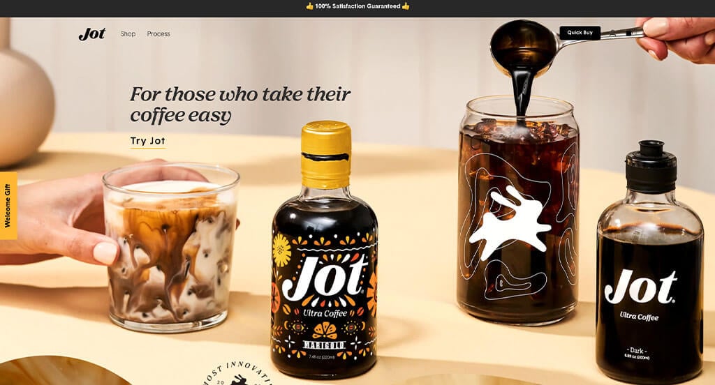
There are a lot of great qualities of this website. For starters, Jot is a coffee company, and they went with a color scheme entirely related to the various shades of coffee and cream.
As you scroll through this website, you’ll find a nice assortment of animated videos showing their coffee product being added to a milk-like drink, user-generated content from reviews, lifestyle photography of people enjoying the product, and more!
Admittedly, we became somewhat lost in the ordering process while reviewing. However, after clicking on Shop in the navigation we were brought back to a familiar looking product page. The order customization section is very nice on this page.
For anyone looking for design styles that relate to coffee websites, this best website design example is one to review!
First time ranking in our list!
50. Robin Golf
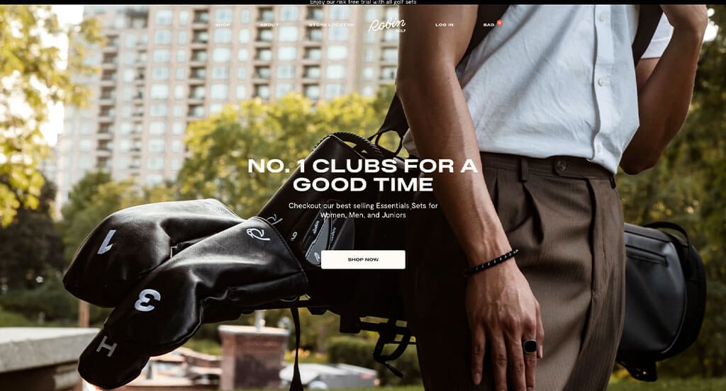
Why not end off with a golfing website? This website design goes for a classic, modern-traditional look and feel. It uses pleasing colors of an earth-tone feel and has smooth contemporary fonts.
As you scroll on the website, you’ll find all kinds of nice product photos and lifestyle photos. In some areas, the images are even shaped like golf courses to make everything seem more stitched-together.
The shopping category pages use a nice hover effect for product images. The product pages have a two-column photo grid, like AllBirds website. In this area, you’ll find product images and lifestyle images. As you scroll through the product page you’ll even be introduced to the story and features of the products and company. This is altogether a great website design example to review when building out your next website!
Ranked in our Best Sports Websites Article
More Best Website Design Examples
To further inspire you in your upcoming website development project, we curated multiple collections of high-quality websites by CMS platform, layout type, and business industry.
We hope these articles will immerse you in the world of web design, offering insights into the strategies and aesthetics employed to create engaging user experiences.
Best Website Designs by Platform
The overall look and feel of a website isn’t necessarily determined by the CMS or ecommerce platform. That said, we are often asked about lists of top websites built in a specific platform. Well, here you go!
Best Web Designs by Layout Type
Don’t let your focus be consumed by the look and feel of your website’s homepage. After all, your conversion path might start with a different landing page or product page. Pay attention to the design and experience of all areas of your website.
Check out these articles that discuss visual elements to look out for when building exceptional websites.
Best Websites by Industry
Most of our clients are always interested in seeing examples of great websites in their competitive space. We’ve got almost every business sector covered in our curated lists of the best website designs!
Professional Service Web Designs
If you are in the professional services industry, don’t be afraid to get creative on your next website design by checking out some of these exciting examples.
Construction & Home Service Web Designs
When it comes to home services contractors, the top performing websites always focus on getting leads. It isn’t uncommon to find home services websites pushing contact forms, service area maps, special discount offers, lead magnets, local reviews / testimonials, and appointment schedulers above the fold of their homepage or landing pages.
We’ve tried to find websites that do a great job of incorporating these lead generation design elements into their websites. Check them out below!
- 50 Best Roofing Websites
- 50 Best Contractor Websites
- 49 Best HVAC Websites
- 51 Creative Landscaping Website Examples
- 50 Best Home Builder Websites
- 42 Best Cleaning Company Websites
- 35 Creative Pest Control Web Designs
- 52 Awesome Concrete Company Websites
- 23 Professional Locksmith Website Examples
- 50 Best Electrician Websites
Health & Medical Website Designs
Most health and medical websites tend to lean toward clean-cut, professional website layouts. However, we were able to find several that break free from these design norms.
These curated lists of top medical websites provide well-rounded examples of what you might want to consider when designing your next health-related website.
Food & Beverage Website Designs
We’ve found hundreds of mouthwatering websites for you to review in the food and beverage industry!
Other Website Designs
There are so many awesome website designs to consider! Here are a few more top websites, broken out into various industries, for you to consider.
- 50 Corporate Website Design Examples
- 50 Best Small Business Websites
- 50 Best Manufacturing Web Designs
- 50 Best Industrial Website Designs
- 50 Top-Ranked Non-Profit Websites
- 50 Awesome B2B Website Examples
- 50 Top Ranked Church Website Examples
- 50 Best Consultant Website Designs
- 50 Great Educational Websites
- 50 Awesome Informational Websites
- 50 Best Wedding Website Designs
- 50 Great Subscription Website Examples
- 25 Best City Website Layouts
- 40 Inspiring Woodworking Website Ideas
- 47 Best Dispensary Website Examples
- Top 25 Computer Repair Sites
- 40 Awesome Auto Dealer Websites
- 55 Best Hotel Websites
- 47 Best Finance Websites
- 28 Best Funeral Home Sites
- Top 42 Mortgage Broker Websites
- 50 Best Auto Repair Websites
- 50 Unique Hair Salon Example Websites
- 50 Best Daycare Web Designs
- 25 Awesome Tattoo Websites
- 50 Unique Sports Websites
- 50 Best Jewelry Website Examples
- 50 Creative Photographer Sites
- 50 Top Ranked Travel Agency Websites
- 50 Creative Fashion Websites
- 50 Interesting Museum Website Designs
- 50 Best Software Website Designs
- 50 Captivating Tourism Web Designs
- 46 Best Florist Web Design Examples
- 45 Best Automotive Website Examples
- 20 Intriguing Artisan Websites
- Top 49 Ranked Agricultural Sites
- Our 20 Favorite Web Design Companies
- 46 Best Staffing Agency Websites
- 42 Best Catering Websites
- 24 Best Limo Websites
- Best 49 Self Storage Websites
Did we miss an industry? If so, let us know in the comments so we can add to the list!
How to Build a Great Website
Are you in the process of building a new website? How exciting!
Let’s walk through some of the most important steps in building out a new website or performing a website redesign.
Feel free to skip the first few sections if you already have a domain name, hosting service, and website platform picked out!
1.) Purchasing a Domain Name
If you already have a domain name, just scroll down to the next step.
Picking out a domain name for your website is a crucial step in establishing your online identity. It serves as the address that visitors will use to access your website, and it plays a significant role in branding and recognition.
Here’s a step-by-step process to help you choose the perfect domain name:
- Brainstorm: Start by thinking of ideas for your domain name. Consider the name of your business, your niche, or keywords related to your products / services. Try for a domain name that is memorable, relevant, and reflects your personality.
- Simplicity: Try to keep your domain name simple, and easy to spell and pronounce. Avoid using complex words, hyphens, or numbers, as they can make it more difficult for people to remember or type correctly.
- Consistency: If your business has an established brand name, it’s generally a good idea to include it in your domain name. This helps with brand recognition and consistency across your online presence. You’d think this is obvious, but many of our clients have business names and domain names that are completely different.
- Keywords: Including relevant keywords in your domain name can help improve your website’s visibility in search engine results. However, don’t sacrifice readability and brand appeal for the sake of keywords.
- Availability: Once you have a few potential domain name options, it’s time to verify their availability. Use domain name registration websites to see if your desired domain names are already taken. If they are, consider other options. If the domain name is registered, but doesn’t have a website on it, you might be able to see if the owner is willing to sell it to you. In most cases, spending more than $500 to purchase a for-sale domain name isn’t a good business decision.
- Domain Extensions: Consider which domain extension best suits your website’s purpose. While .com is the most common and widely recognized extension, there are many other options available, such as .net, .org, or industry-specific extensions like .photography or .design. Choose an extension that aligns with your brand and target audience. We definitely recommend exhausting all options before choosing an extension other than .com.
- Legal Considerations: Before finalizing your domain name, it’s important to conduct a trademark search to ensure that your chosen name doesn’t infringe upon someone else’s intellectual property. This helps you avoid legal issues in the future. For example, if you plan to sell products on Shopify, you will run into trouble having the word Shopify in your domain name.
- Register the Domain: Once you’ve settled on a domain name that’s available, it’s time to register it! Choose a reputable domain registrar, set up an account, and follow the registration process. As an agency, we’ve had to log in and manage domains in dozens of client accounts at various domain name registrars. We’ve found GoDaddy and Namecheap to be the easiest to manage domain name registrations.
2.) Choosing a Website Platform
If you already have a domain name and website platform selected, move onto the next step.
After figuring out your domain name, the next step is selecting a website platform for your next website.
There are several popular options available. Let’s take a closer look at WordPress, SquareSpace, Wix, WooCommerce, Shopify, and BigCommerce, and explore the process of choosing the right one for your needs:
For Content Websites:
- WordPress: WordPress is a versatile and widely-used content management system (CMS) that offers tremendous flexibility and customization options. It caters to all types of websites, from simple blogs to complex ecommerce stores. With thousands of themes and plugins available, WordPress allows you to create a highly customized website tailored to your specific requirements. It’s a great choice if you value control and want the ability to expand your website’s functionality over time. Although there is a SaaS offering for WordPress, most people who use WordPress have the open-source version installed on a web hosting account.
- SquareSpace: The SquareSpace platform is often thought of as an alternative to the hosted WordPress solution. It has many of the same page building features. We’ve taken over website editing and SEO for a number of SquareSpace websites and it isn’t a bad page builder. You won’t need a separate web hosting service with SquareSpace.
- Wix: The Wix platform is somewhat similar to SquareSpace. It has many of the same page building features and is a hosted solution. We’ve taken over website editing and SEO for a number of Wix website and it isn’t a bad page builder. You won’t need a separate web hosting service with Wix.
For Ecommerce Websites:
- WooCommerce: If you plan to build an online store using WordPress, WooCommerce is the ecommerce plugin to install. It seamlessly integrates with WordPress, enabling you to add ecommerce functionality to your existing WordPress website. WooCommerce offers a wide range of extensions, payment gateways, and inventory management tools, making it an ideal choice for businesses looking to sell online.
- Shopify: The Shopify platform is a leading ecommerce solution that provides everything you need to create and manage an online store. It is a hosted ecommerce platform, meaning you don’t need to find a separate web hosting service to use it. Like other ecommerce solutions, it offers a user-friendly interface, customizable themes, built-in security, and a range of features for inventory management, payments, and shipping.
- BigCommerce: The BigCommerce platform is a common competitor to Shopify. It offers a lot of the same features, but has a smaller development community and app marketplace. They do have an extensive API available to help advanced web developers extend the platform.
Web Hosting Requirements
If you choose a platform like WordPress or WooCommerce, you’ll need to find a web hosting service, too.
As a shameless plug, we often recommend our own web hosting because of how great it is for WordPress websites. For recommendations of reliable web hosting services from other companies, consider these:
- WP Engine: This is one of our favorite web hosting services. WP Engine has a great control panel that makes it very easy to create staging websites. Their backup process is also seamless. The only downside we’ve ever seen is the limits they place on PHP max_execution_time. Their pricing also climbs quickly if you need upgraded services.
- SiteGround: We’ve always enjoyed working with SiteGround. Their live chat and email support is great compared to more well-known brands. We’ve never had to wait long to get in touch with someone, and typically the first person we’ve interacted with solved the issue. Their backup tools are very easy to use. They also have very reasonable pricing.
- Digital Ocean: This is a great option for cloud hosting. We’ve never had issues with the Digital Ocean cloud network, unlike other cloud networks we’ve tried. Cloud hosting can be an expensive option after factoring in droplet (server instance) costs, in addition to operating system, control panel, server software, offsite backup, and server management fees. For a server administrator recommendation, check out AdminGeekZ.
3.) Picking out a Website Template
After you’ve picked out your website platform, its time to get busy planning out the design of your website!
Most website owners will opt to purchase and customize a third-party website template, since it drastically reduces development cost and turnaround. However, if you prefer a completely ground up solution you can absolutely hire a custom web developer or custom ecommerce developer to build out your theme from scratch.
For the purpose of this article, let’s focus on suggestions for finding a pre-built website template! Here are some links to all the main theme marketplaces to consider:
WordPress Themes
You can find free themes at wordpress.org, or consider options through marketplaces like ThemeForest.
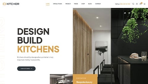
Kitchor – Themeforest
$49
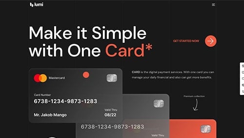
Lumi – Themeforest
$59
WooCommerce Themes
You’ll find plenty of themes for WooCommerce on ThemeForest.
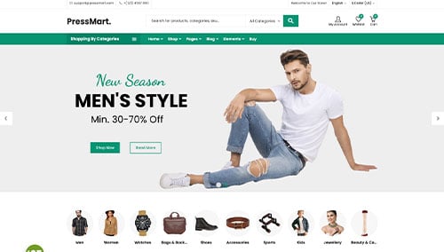
PressMart – Themeforest
$35
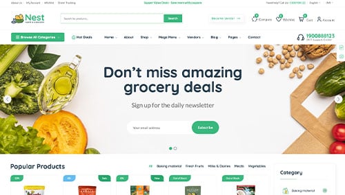
Nest – Themeforest
$39
Shopify Themes
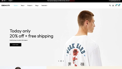
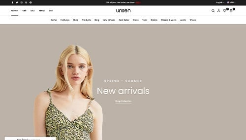
You can find free and paid themes at themes.shopify.com, or consider options through marketplaces like ThemeForest.
Demati – Themeforest
$48
Unsen – Themeforest
$69
BigCommerce Themes
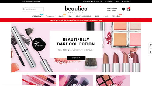
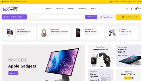
You can find free themes at bigcommerce.com, or consider options through marketplaces like ThemeForest.
Beautica – Themeforest
$139
FlexCart – Themeforest
$99
Wix Themes
You can find free and paid themes in their marketplace at wix.com.
4.) Writing Content & Adding Images
Now that you’ve got your domain name, website platform, and theme figured out it is time to start building content!
There are several tips you can follow to create engaging and effective website copy. Let’s go over a few:
- Understand your target audience: Before writing a single word, have a clear understanding of your target audience. Define their demographics, preferences, and needs. Tailor your content to address their pain points, provide value, and resonate with them. This will help ensure you get ranked in search engines and convert visitors that land on your page.
- Define your key messages: Determine the main messages you want to convey through your website content. These should align with your brand, highlight your unique selling points, and clearly communicate the benefits of your products or services.
- Keep it concise and scannable: Online readers tend to skim content, so make sure your writing is concise and easy to digest. Use short paragraphs, bullet points, subheadings, and bold text to break up the content and improve readability.
- Use clear and compelling headlines: Craft attention-grabbing headlines that immediately convey the value and relevance of your content. A well-crafted headline can entice visitors to keep reading and explore your website further.
- Incorporate keywords strategically: Research relevant keywords and incorporate them naturally throughout your content. This can improve your website’s visibility in search engine results. However, avoid keyword stuffing, as it can negatively impact readability and user experience. Try tools like Ahrefs or SEMRush for keyword research.
- Maintain a conversational tone: Write in a conversational manner that resonates with your audience. Avoid jargon or overly technical language unless your target audience specifically requires it. Engage your readers by addressing them directly and using a friendly, approachable style.
- Edit and proofread: Always edit and proofread your content before publishing. Check for grammar, spelling, and punctuation errors. Ensure the flow of your content is smooth and logical, and that it aligns with your brand voice and style guidelines. Try a tool like Grammarly for help!
- Leverage ChatGPT for assistance: If you’re struggling with generating ideas or need help refining your content, consider leveraging AI tools like ChatGPT.
You’ll want to break up long sections of text by adding relevant, quality images to your content. Here are some tips:
- Use high-quality images: Opt for high-resolution images that are visually appealing and well-composed. Blurry or pixelated images can detract from the overall quality of your website.
- Ensure relevance: Select images that are relevant to your content and help illustrate your message. Images should enhance the text and provide additional context or visual interest.
- Consider stock photo resources: Utilize reputable stock photo websites like Unsplash, Pixabay, or Shutterstock to find a wide range of professional-quality images that match your content theme. Be mindful of licensing requirements and attribute images as necessary.
- Customize images when possible: If you have the skills or resources, consider customizing or branding images to align with your brand identity. This can help create a cohesive visual experience for your visitors. Try tools like Adobe Photoshop or Canva.
- Optimize image file sizes: Compress images to optimize their file sizes without sacrificing quality. Large image files can slow down your website’s loading speed, impacting user experience and SEO. Try tools like TinyPNG.
Remember, well-crafted website content and high-quality images work together to engage visitors and deliver your message effectively. By following these tips, you can create compelling content that resonates with your audience and enhances their overall experience on your website.
5.) Post Launch Work
Once you have built and launched your website, there are several important tasks and services to consider in order to maximize its effectiveness. Here are some basic suggestions to help you navigate post-launch activities:
- Search Engine Optimization (SEO): Implementing SEO strategies is crucial to improving your website’s visibility in search engine result pages. You should conduct keyword research, optimize your content, and ensure your website has a solid internal linking structure. Regularly update and create fresh, high-quality content to attract organic traffic. If you want, consider hiring our SEO team for or checking out third-party providers like The HOTH.
- Paid Advertising: For faster turnaround in traffic, consider utilizing paid advertising platforms like Google Ads or Facebook Ads to drive targeted traffic to your website. You can hire our PPC management services or find talented professionals on websites like Mayple.
- Conversion Rate Optimization (CRO): Analyze your website’s performance and user behavior using tools like Google Analytics. Identify areas where users may drop off or encounter barriers to conversion. Conduct A/B testing using tools like VWO to make data-driven changes to improve your website’s conversion rates and overall user experience.
- Website Security: Protecting your website and user data is crucial. Ensure you have robust security measures in place, such as SSL certificates, web application firewalls (like Sucuri), and regular backups. Keep your CMS, plugins, and themes up to date to minimize vulnerabilities. Monitor your website for any potential security risks and respond promptly to any issues. It isn’t a bad idea to monitor for website uptime, through a service like UptimeRobot, too.
- Website Maintenance: Regularly maintain your website to ensure its optimal performance. If you are using WordPress, this includes updating plugins and themes, monitoring website speed and performance, and resolving any broken links or errors. If you want, consider hiring our website maintenance services or consider a freelancer from Upwork. Don’t forget to regularly backup your website to safeguard against data loss or technical issues.
- User Feedback and Testing: Actively seek user feedback to understand visitor experiences and identify areas for improvement. Implement user testing and gather insights on how users interact with your website. Use this feedback to make iterative enhancements and continuously optimize the user experience.
- Content Updates: Keep your website content fresh and up to date. Regularly publish new blog posts, update product or service information, and ensure that all information is accurate and relevant. Engaging and valuable content not only attracts visitors but also encourages them to return and share your content with others.
Remember, post-launch digital marketing activities are crucial for the long-term success of your website. Stay proactive, monitor performance, and adapt your strategies to achieve your business goals and meet the needs of your audience.
Award-Winning Website Directories
If you are looking for further resources to find the best website designs on the internet, we recommend you check out some of these amazing websites. Each of these maintain directories of high-quality websites with user-generated voting systems to people to submit and vote on the best web designs!
1.) Awwwards
Awwwards is a digital platform and community dedicated to recognizing and promoting the talent and effort of web designers, developers, and agencies from around the world. Established in 2009, Awwwards aims to create a meeting point where web professionals from across the globe can come together to find inspiration, share knowledge, and stay updated with the latest trends in web design and development.
2.) CSS Design Awards
CSS Design Awards (CSSDA) is a popular digital platform and community that focuses on recognizing and showcasing exceptional web design and development work from around the world. Established in 2010, the platform serves as an inspiration hub for web designers, developers, and digital agencies, as well as a platform for acknowledging their talent and creativity.
3.) Webby Awards
Webby Awards is an annual international awards event that honors excellence and innovation on the internet. Established in 1996 by the International Academy of Digital Arts and Sciences (IADAS), the Webby Awards is often referred to as the “Oscars of the Internet,” recognizing the best websites, online films and videos, advertising and media, mobile sites and apps, and social platforms across various categories.
4.) CSS Winner
CSS Winner is a digital platform and community focused on recognizing, showcasing, and celebrating exceptional web design and development projects from around the world. Established as an inspiration hub for web designers, developers, and digital agencies, Csswinner.com aims to acknowledge the creative talent and skillful execution of web-based projects.
5.) The FWA
The Favourite Website Awards (The FWA) is a renowned digital platform and community that focuses on recognizing, showcasing, and celebrating outstanding web design and development projects from around the world. Established in 2000 by Rob Ford, The FWA aims to serve as a source of inspiration and a platform for acknowledging the creativity, innovation, and technical excellence of web designers, developers, and digital agencies.